
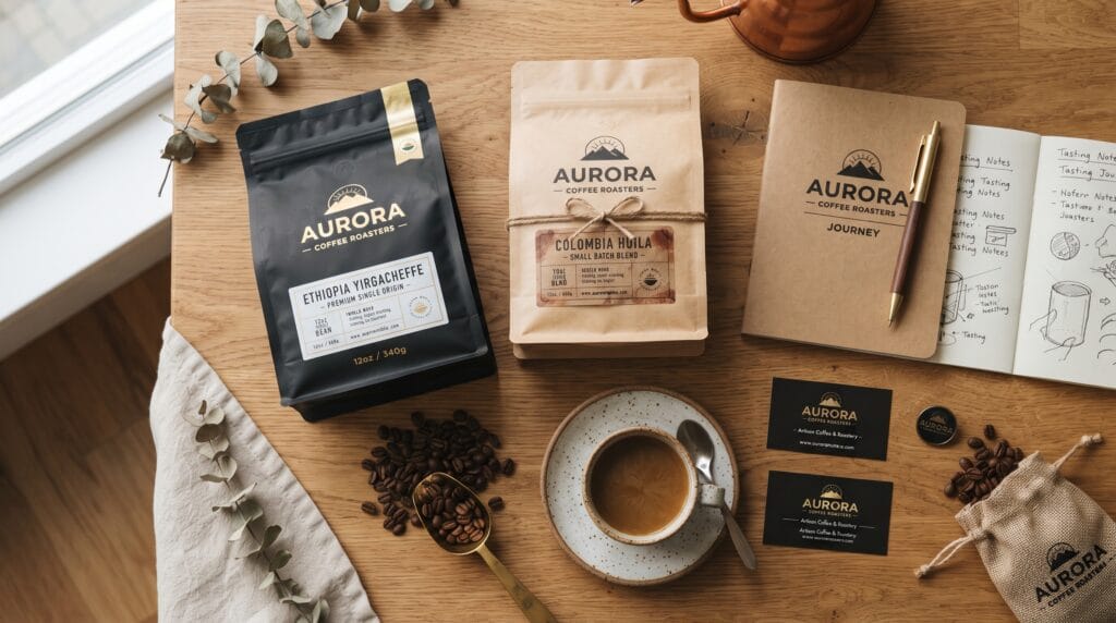
Coffee packaging design plays a major role in how customers perceive a coffee brand before they ever taste the product. A professionally designed coffee bag or label can communicate quality, origin, roast style, personality, and brand values within seconds. For cafes and coffee roasters, packaging is not simply a container. It is one of the most visible parts of the brand experience.
Coffee shelves are often crowded with kraft bags, bold illustrations, minimalist labels, premium typography, and colorful specialty coffee packaging.
That makes differentiation especially important.
A successful package should attract attention without sacrificing clarity. Customers need to understand what the coffee is, where it comes from, how it tastes, and why they should choose it.
This guide explains how to create coffee packaging design that looks professional, works consistently across different products, and strengthens the overall coffee brand.
Start Coffee Packaging Design With Brand Strategy
Before choosing colors or designing a label, define the brand.
Ask:
- Who is the target customer?
- What kind of coffee do you sell?
- Is the brand premium or affordable?
- Is it modern, traditional, playful, or artisanal?
- What makes the coffee business different?
- Where will the products be sold?
A specialty roaster targeting coffee enthusiasts may need a different visual identity from a neighborhood cafe selling approachable everyday blends.
Brand strategy gives the design direction.
Without it, packaging can look attractive but disconnected from the business.
Understand Your Target Coffee Customer
Different coffee buyers value different things.
Some customers may care about:
- Origin
- Processing method
- Variety
- Roast profile
- Tasting notes
Others may mainly want:
- Strong coffee
- Easy brewing
- Good value
- Attractive packaging
Your coffee packaging design should make the most important information easy for your ideal customer to find.
Do not overload the front of the bag with information that your audience does not need immediately.
Research Competitor Coffee Packaging
Competitor research helps reveal common visual patterns.
Visit coffee shops, supermarkets, and online coffee stores.
Look at:
- Bag colors
- Label shapes
- Typography
- Illustration styles
- Materials
- Logo placement
- Information hierarchy
Create a visual reference board.
Then identify opportunities to look different.
If most competitors use brown kraft bags with black labels, a cleaner white package or stronger color system may create better recognition.
Competitor research should help you find differentiation, not encourage imitation.
Choose the Right Coffee Packaging Format
The package format affects the entire design.
Common coffee packaging includes:
- Flat-bottom bags
- Side-gusset bags
- Stand-up pouches
- Boxes
- Cans
- Paper tubes
- Small sample packs
Coffee bags are particularly popular because they are lightweight, practical, and available in many materials.
When designing, consider:
- Bag dimensions
- Front panel size
- Gussets
- Seams
- Valve position
- Zipper position
Always design around the actual dieline instead of creating artwork before knowing the final package dimensions.
Build Clear Coffee Packaging Design Hierarchy
Packaging contains several pieces of information.
They should not all have equal visual importance.
A typical hierarchy might be:
- Brand name
- Coffee name
- Origin
- Roast level
- Tasting notes
- Processing details
- Weight
- Brewing information
Decide what the customer should notice first.
Then use:
- Size
- Position
- Typography
- Weight
- Color
- Spacing
to guide attention.
Strong coffee packaging design should feel easy to scan rather than visually crowded.
Make the Brand Name Easy to Recognize
Brand recognition matters when customers return to purchase another bag.
The logo or brand name should therefore have a consistent location.
Possible positions include:
- Top center
- Upper left
- Centered label
- Integrated into the main graphic
Avoid changing logo placement dramatically between every coffee variety.
A consistent structure helps customers recognize the brand even when individual products use different colors or illustrations.
Use Typography That Matches the Coffee Brand
Typography can completely change the personality of the package.
Serif Typography
Serif fonts can communicate:
- Craft
- Heritage
- Premium quality
- Tradition
They work well for artisan and specialty coffee brands.
Sans Serif Typography
Sans serif fonts can feel:
- Modern
- Clean
- Minimal
- Accessible
They are useful for contemporary cafes and modern roasting companies.
Display Typography
Bold display fonts can give packaging more personality.
They may suit:
- Youth-focused coffee brands
- Creative cafes
- Limited editions
- Experimental roasters
However, use expressive fonts carefully.
Supporting information should remain easy to read.
Limit Font Choices in Coffee Packaging Design
Too many fonts can make packaging look inconsistent.
In many cases, two typefaces are enough.
For example:
- Primary Typeface: Brand and coffee name
- Secondary Typeface: Origin, tasting notes, and technical information
You can create additional hierarchy with:
- Different weights
- Capitalization
- Font size
- Tracking
Keeping the typography system controlled usually produces more professional results.
Create a Memorable Color System
Color can help customers recognize coffee varieties quickly.
Instead of choosing random colors for each bag, build a system.
For example:
- Yellow: Light roast
- Orange: Medium roast
- Deep red: Dark roast
Or use color to distinguish coffee origin:
- Green: Colombia
- Blue: Ethiopia
- Red: Brazil
The exact system is less important than consistency.
Customers should gradually understand how the colors relate to the product range.
Also Read: Modern Snack Packaging Design Trends for Better Branding
Use Color Without Losing Brand Recognition
Product variation is useful, but the entire range should still look like one family.
Keep certain elements consistent, such as:
- Logo position
- Typography
- Label shape
- Layout grid
- Illustration style
Then change only selected elements.
This creates variety without losing the core coffee packaging design identity.
Consider Minimal Coffee Packaging Design
Minimal packaging is popular in specialty coffee.
It often uses:
- Neutral backgrounds
- Simple typography
- Small labels
- Generous negative space
- Limited colors
Minimal design can feel premium because it removes unnecessary distractions.
However, minimal packaging requires precision.
Poor spacing, weak typography, or inconsistent alignment becomes very noticeable when there are fewer visual elements.
Minimal should mean intentional, not unfinished.
Use Illustration to Build Personality
Illustration can make coffee packaging more distinctive.
Possible directions include:
- Botanical drawings
- Landscapes
- Abstract patterns
- Coffee plants
- Local culture
- Hand-drawn graphics
- Geometric artwork
Illustration can also tell the story of the coffee origin.
For example, packaging for a particular farm might reference its landscape or local environment.
Keep the illustration style consistent across the product family.
Use Photography Carefully
Photography is less common than illustration in some specialty coffee markets, but it can still work.
Possible subjects include:
- Coffee farms
- Producers
- Landscapes
- Beans
- Brewing moments
If you use photography, make sure typography remains readable.
Avoid placing important information over visually busy areas.
Photography should support the brand story rather than overwhelm the packaging.
Highlight Coffee Origin Clearly
Origin is one of the most important details for specialty coffee buyers.
Common origin information includes:
- Country
- Region
- Farm
- Producer
- Cooperative
This information can become a major part of the front label.
For example:
ETHIOPIA
Yirgacheffe
Single Origin
Making origin information visible helps customers compare different coffees quickly.
Include Tasting Notes in Coffee Packaging Design
Tasting notes help customers imagine the flavor before buying.
Examples include:
- Chocolate
- Caramel
- Citrus
- Strawberry
- Floral
- Hazelnut
- Peach
Keep tasting notes concise.
Three or four clear descriptors are often more useful than long descriptions.
You can display them as:
- Simple text
- Small icons
- Color-coded labels
- Short lists
Make sure the design does not imply that artificial flavors were added if the notes simply describe natural coffee characteristics.
Show the Roast Level Clearly
Customers often search for coffee based on roast preference.
Make the roast level easy to identify.
Options include:
- Light Roast
- Medium Roast
- Dark Roast
You might also use a simple visual scale.
Do not create a complicated roast indicator that customers cannot understand immediately.
Clarity matters more than decoration.
Add Processing Information for Specialty Coffee
More advanced coffee buyers may want to know the processing method.
Common examples include:
- Washed
- Natural
- Honey
- Anaerobic
This information does not always need to dominate the front panel.
Place it within a secondary information section where interested customers can find it easily.
Create a Flexible Coffee Packaging Design System
A professional coffee brand rarely sells only one product.
You may eventually need packaging for:
- Single origins
- Blends
- Decaf coffee
- Seasonal releases
- Limited editions
- Espresso
- Subscription coffee
Build a design system that can grow.
For example, create one consistent layout and change:
- Color
- Illustration
- Coffee name
- Origin
- Tasting notes
A flexible coffee packaging design system saves time and strengthens brand consistency.
Also Read: Top Cosmetic Packaging Design Trends for Better Branding
Design the Front and Back Together
Do not treat the front panel as the only important area.
The back can contain:
- Brand story
- Brewing instructions
- Producer information
- Roast date
- Website
- Social media
- Barcode
- Required product information
Organize these elements carefully.
Avoid filling every available space.
Negative space helps information feel easier to understand.
Consider the Coffee Bag Material
Material affects how the final design looks.
Common choices include:
- Matte plastic
- Glossy film
- Kraft paper
- Foil-lined bags
- Recyclable materials
- Compostable packaging
A design that looks excellent on smooth white material may appear very different on brown kraft paper.
Colors can shift.
Fine typography may lose clarity.
Always request samples or test prints whenever possible.
Sustainable Coffee Packaging Design
Sustainability is increasingly important for many coffee customers.
Brands may explore:
- Recyclable pouches
- Compostable bags
- Reduced material
- Refillable containers
- Paper-based systems
If sustainability is part of the brand strategy, communicate it clearly and accurately.
Avoid vague environmental claims.
The visual identity can support the sustainable positioning through restrained materials, natural palettes, and simple printing, but the claims themselves should be based on the actual package specification.
Design for Shelf Impact
A coffee bag may look beautiful on a computer screen but disappear on a crowded retail shelf.
Test the package among competitors.
Ask:
- Can the brand name be seen from a distance?
- Is the color distinctive?
- Is the coffee type obvious?
- Does the package look too similar to surrounding products?
Strong shelf presence does not always require loud colors.
Contrast, simplicity, and recognizable structure can also create visibility.
Create Coffee Packaging Design for Online Stores
Many coffee businesses sell directly through websites.
Online shoppers often see packaging as a small thumbnail.
This creates additional requirements.
The front panel should remain understandable at reduced size.
Large elements such as:
- Brand name
- Product name
- Primary color
- Main graphic
should remain recognizable.
Small secondary information can appear in additional product images.
Test Coffee Packaging With Mockups
Mockups help evaluate the design in realistic situations.
Test the package:
- Standing upright
- Lying flat
- On a cafe shelf
- Beside other coffee products
- In an online product grid
Mockups can reveal composition problems.
However, always review the flat artwork too.
A dramatic mockup should never hide weak typography or poor hierarchy.
Print a Physical Prototype
Before production, print the design at actual size.
Wrap it around a sample package if possible.
Check:
- Text size
- Color
- Spacing
- Logo visibility
- Fold areas
- Seams
- Valve position
- Barcode position
A physical prototype often reveals problems that are easy to miss on screen.
Common Coffee Packaging Design Mistakes
Avoid these frequent problems.
Too Much Information on the Front
Customers should not need to read a paragraph before understanding the coffee.
Weak Brand Recognition
Changing every element between products can make the range feel unrelated.
Too Many Fonts
Excessive type styles create visual noise.
Generic Coffee Imagery
Coffee cups and beans can become predictable when used without a distinctive concept.
Poor Information Hierarchy
Customers should quickly understand the coffee name, origin, and main characteristics.
Ignoring the Package Structure
Important elements should not disappear into folds, seals, or gussets.
Designing Only for Mockups
Always test actual printed size.
Professional Coffee Packaging Design Workflow
A structured workflow makes the process easier.
1. Define the Brand
Understand audience, positioning, personality, and competitors.
2. Select the Packaging Format
Confirm bag dimensions, material, and dieline.
3. Organize Product Information
List everything that must appear.
4. Build the Hierarchy
Determine what customers should see first.
5. Create Visual Directions
Explore typography, color, illustration, and layout.
6. Develop a Packaging System
Make sure the concept works across multiple coffee varieties.
7. Test Real Applications
Use mockups and online thumbnails.
8. Print at Actual Size
Check readability and alignment.
9. Review Production Files
Confirm bleed, safe areas, colors, and technical requirements.
10. Maintain Brand Consistency
Document rules for future packaging.
Following this process makes future product launches faster and more consistent.
Coffee Packaging Design Checklist
Before approving the final package, ask:
- Is the brand easy to recognize?
- Is the coffee name clear?
- Is the origin easy to find?
- Are tasting notes readable?
- Is the roast level visible?
- Does typography fit the brand?
- Are the fonts consistent?
- Is the color system organized?
- Does the design work across multiple varieties?
- Is the package readable at actual size?
- Does it stand out against competitors?
- Does the design work as an online thumbnail?
- Are folds, seams, and valves considered?
- Is the barcode positioned correctly?
- Does the final material support the visual concept?
- Is the overall package easy to understand?
A final checklist can prevent small problems from reaching production.
Also Read: Packaging Color Psychology Guide for Better Brand Perception
Final Thoughts on Coffee Packaging Design
Professional coffee packaging design combines brand strategy, visual hierarchy, typography, color, useful product information, materials, and production awareness.
Start by understanding the audience and positioning of the coffee brand.
Then build a flexible visual system rather than designing each bag independently.
Make the brand easy to recognize, keep product information organized, and give important details such as origin, roast level, and tasting notes a clear hierarchy.
Typography should remain readable.
Colors should have a purpose.
Illustrations and graphics should strengthen the brand rather than simply decorate the package.
Most importantly, test your coffee packaging design in real conditions.
Print it at actual size, place it beside competing products, and review how it appears online.
The strongest coffee packaging does more than look attractive. It helps customers understand the product, remember the brand, and confidently choose one coffee from many alternatives.
When strategy and design work together, coffee packaging design can become one of the most powerful branding tools available to a cafe or coffee roaster.
For high-quality fonts to boost your income, check out Letter Crafted. Our professional fonts are perfect for branding, marketing, and content creation. So, don’t miss this opportunity.