
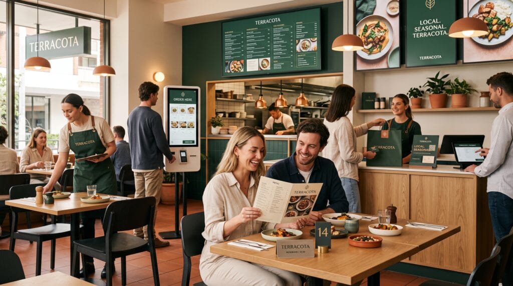
Restaurant graphic design influences how customers experience a food business before they taste a single dish. The storefront sign, logo, menu, website, takeaway packaging, and social media posts all create expectations about food quality, pricing, personality, and service. When these visual elements feel consistent and professional, customers are more likely to trust the restaurant and remember it after their visit.
Good design is not limited to creating an attractive logo. It should help customers find information, understand menu options, navigate the restaurant, place orders, and recognize the brand across physical and digital channels. A beautiful menu that is difficult to read may cause frustration, while stylish packaging that fails to protect the food can weaken the overall experience.
Effective restaurant graphic design combines visual identity with practical communication. This guide explains how food businesses can improve logos, colors, typography, menus, packaging, signage, websites, and social media to create a stronger customer journey.
Why Restaurant Graphic Design Matters
Customers form opinions quickly. They may discover a restaurant through an Instagram post, view its menu online, notice its storefront, or receive a recommendation from a friend. Visual design helps shape what they expect from each interaction.
Strong restaurant graphic design can help a food business:
- Create a memorable identity
- Attract the right customers
- Communicate its price level
- Improve menu readability
- Build trust before a visit
- Strengthen product packaging
- Create consistent social content
- Improve online ordering
- Differentiate itself from competitors
- Support long-term recognition
The design should reflect the restaurant concept. A premium fine-dining restaurant may use elegant typography, restrained colors, and high-quality materials. A family cafe may choose warmer colors, friendly illustrations, and conversational language.
Neither direction is automatically better. The visual identity should match the food, atmosphere, audience, and service experience.
Build Restaurant Graphic Design Around a Clear Strategy
Before designing visual materials, define the foundation of the restaurant brand.
Consider:
- The type of food being served
- The target customer
- The average price
- The dining format
- The restaurant location
- The main competitors
- The brand personality
- The desired customer experience
A small artisan bakery may want to feel warm, handmade, and welcoming. A modern sushi restaurant may need a clean, refined, and precise identity. A food truck may prefer bold colors and simple graphics that remain visible from a distance.
These decisions guide the complete restaurant graphic design system and prevent different materials from looking disconnected.
Restaurant Logo Design for Better Recognition
The logo is one of the most visible elements of a restaurant identity. It appears on signage, menus, packaging, uniforms, social media, websites, and delivery platforms.
A strong restaurant logo should be:
- Easy to recognize
- Readable at small sizes
- Suitable for digital and print use
- Relevant to the restaurant concept
- Different from competing businesses
- Flexible across many applications
Choose an Appropriate Logo Style
Common restaurant logo styles include:
- Wordmarks
- Monograms
- Badge logos
- Mascot logos
- Illustrated symbols
- Hand-lettered logos
- Minimal icons
- Heritage-inspired emblems
A modern cafe might use a clean wordmark, while a casual burger business may benefit from a bold mascot or badge. An artisan bakery could use custom lettering to emphasize its handmade personality.
Avoid using too many small details. Complex illustrations may look impressive on a large screen but become unclear on a packaging sticker or social profile image.
Create Flexible Restaurant Logo Variations
A complete logo system should include:
- Primary horizontal logo
- Secondary stacked logo
- Compact symbol
- Black-and-white version
- Small-size variation
- Social media profile icon
These variations help maintain consistent restaurant graphic design without forcing one logo format into every available space.
Choose a Restaurant Color Palette
Color contributes to mood, recognition, and perceived value. The palette should match the food and atmosphere rather than follow trends without purpose.
Warm Red and Orange
Red and orange feel energetic, bold, and welcoming. They are often suitable for fast-casual restaurants, spicy food brands, pizzerias, and lively dining concepts.
Green and Natural Neutrals
Green, beige, brown, and cream can communicate freshness, organic ingredients, sustainability, or natural preparation. These colors work well for healthy food, vegan restaurants, cafe’s, and farm-to-table businesses.
Black, White, and Gold
This combination can create a premium impression. It is suitable for fine dining, luxury cafe’s, specialty desserts, and upscale hospitality brands.
Blue and White
Blue and white can feel clean, calm, and refreshing. They often suit seafood restaurants, coastal cafe’s, and beverage businesses.
Bright Playful Colors
Yellow, pink, turquoise, and other energetic colors can support dessert shops, children’s food, casual dining, and modern social-first brands.
Professional restaurant graphic design usually relies on one primary color, one supporting color, an accent, and a small selection of neutrals.
Restaurant Typography That Improves Readability
Typography communicates personality while organizing information. Restaurants need typefaces that work across logos, menus, signs, websites, and packaging.
A practical type system may include:
- One display typeface
- One body typeface
- An optional accent typeface
- Several controlled font weights
Create a Clear Typography Hierarchy
Menu typography should make it easy to identify:
- Menu categories
- Dish names
- Descriptions
- Prices
- Dietary information
Use size, weight, spacing, and position to separate each level.
Limit Decorative Fonts
Decorative typefaces can add personality to headings and campaign graphics. However, they are usually difficult to read in long descriptions or small text.
Use readable fonts for ingredients, prices, addresses, ordering instructions, and allergen information.
Typography is one of the most important parts of restaurant graphic design because customers need to process information quickly, often in busy or dimly lit environments.
Restaurant Menu Graphic Design
The menu connects branding with purchasing decisions. It should be attractive, organized, and easy to scan.
Organize Menu Categories Clearly
Use familiar categories such as:
- Starters
- Main dishes
- Sides
- Drinks
- Desserts
- Specials
- kid’s meals
- Vegetarian options
Creative category names can support the restaurant personality, but they should not confuse customers.
Keep Menu Descriptions Focused
Descriptions should explain the main ingredients, preparation method, or flavor. Long paragraphs slow down decision-making and make the menu feel crowded.
A useful description might include:
- Main ingredient
- Cooking style
- Important sauce
- Key accompaniment
Highlight Selected Items
Design emphasis can draw attention to:
- Bestsellers
- Chef recommendations
- Seasonal dishes
- Limited offers
- Signature products
Use highlights selectively. When every item receives a border, icon, background, or special label, the menu loses hierarchy.
Format Prices Consistently
Choose one pricing style and apply it throughout the menu. Align prices clearly and avoid making them unnecessarily dominant.
Consistent formatting creates a more professional customer experience.
Also Read: Holiday Graphic Design Styles That Inspire Better Designs
Digital Restaurant Menu Design
Customers increasingly view menus through websites, QR codes, tablets, and delivery platforms. Digital menus must work well on mobile screens.
Effective digital restaurant graphic design should provide:
- Fast loading
- Clear categories
- Readable text
- Large tap targets
- Simple navigation
- Current pricing
- Accurate availability
- Accessible contrast
Avoid Difficult PDF Menus
A large printed-menu PDF may require customers to zoom and scroll horizontally on their phones. A responsive webpage is usually easier to use and update.
Create Clear Ordering Actions
Buttons should use direct labels such as:
- Order now
- Add to cart
- Select size
- Choose options
- View details
- Complete order
Important actions should remain easy to find throughout the ordering process.
Restaurant Packaging Graphic Design
Takeaway and delivery packaging extends the brand beyond the restaurant. It also influences how customers perceive cleanliness, quality, and care.
Packaging may include:
- Food boxes
- Cups
- Bags
- Labels
- Stickers
- Napkins
- Sleeves
- Delivery seals
- Cutlery wraps
Effective packaging should protect the food first. Branding should then improve recognition without interfering with usability.
Maintain Consistent Packaging
Use the same:
- Logo variations
- Colors
- Fonts
- Illustration style
- Tone of voice
- Pattern system
This consistency helps customers recognize the restaurant immediately.
Add Useful Packaging Information
Packaging can display:
- Product name
- Reheating instructions
- Storage guidance
- Allergen notes
- Website address
- Social media account
- Thank-you message
- Recycling information
Keep the content organized. Too much text can make small packaging labels difficult to read.
Signage and Environmental Restaurant Graphic Design
Customers depend on signs to find the restaurant and navigate the space.
Important signage may include:
- Storefront logo
- Opening hours
- Entrance signs
- Pickup area
- Ordering instructions
- Table numbers
- Restroom signs
- Directional signs
- Safety notices
Design for Viewing Distance
A sign that looks readable on a laptop may be too small when installed above a storefront or across a dining room.
Test signage at its intended dimensions and viewing distance.
Use Strong Contrast
Signage must remain readable under natural light, indoor lighting, and evening conditions. Text should contrast clearly with its background.
Environmental restaurant graphic design should reduce confusion and make the customer journey feel intuitive.
Restaurant Social Media Graphic Design
Social media is often the first customer touchpoint. A consistent visual presence can help a restaurant become recognizable before people visit.
Useful social content includes:
- Menu promotions
- Food photography
- Customer reviews
- Behind-the-scenes videos
- Staff introductions
- Seasonal offers
- Events
- Opening-hour updates
- New product announcements
Create Reusable Social Templates
Develop templates for:
- Daily specials
- New menu items
- Reviews
- Announcements
- Events
- Promotions
- Educational content
Use consistent fonts, colors, spacing, and image treatments. Templates save time while helping the brand appear organized.
Let Food Remain the Focus
Avoid covering food photography with too many graphics, stickers, borders, or long text blocks. The image should remain clear and appetizing.
Restaurant Website Design
A restaurant website should answer practical questions quickly.
Essential information includes:
- Menu
- Location
- Opening hours
- Contact information
- Reservations
- Online ordering
- Delivery options
- Dietary information
- About the restaurant
Make Important Actions Visible
Place key buttons near the top of the page:
- View menu
- Book a table
- Order online
- Get directions
Customers should not need to search through several pages to complete a common task.
Use Consistent Visual Branding
The website should match the menus, packaging, social content, and physical restaurant. Using completely different fonts or colors online can weaken recognition.
Food Photography and Restaurant Graphic Design
Photography influences how customers imagine the food and atmosphere.
A consistent photography system should define:
- Lighting
- Backgrounds
- Camera angles
- Cropping
- Props
- Color treatment
- Editing style
A rustic restaurant may prefer warm natural lighting and textured surfaces. A modern cafe may use bright backgrounds, clean arrangements, and controlled shadows.
Images should represent realistic portions and presentation. Overediting food photographs can create expectations the real product cannot meet.
Consistent photography strengthens restaurant graphic design across menus, websites, delivery platforms, and social media.
Also Read: Festival Graphic Design Styles for Better Marketing Results
Restaurant Graphic Design for Customer Trust
Customers trust food businesses that communicate clearly.
Design can strengthen trust when:
- Prices are easy to find
- Ingredients are explained
- Allergen information is visible
- Opening hours are current
- Packaging looks clean
- Promotions include clear terms
- Website information matches reality
- Menu photographs represent actual dishes
Graphic design should never hide important information behind decorative styling. Clarity is part of the customer experience.
Accessibility in Restaurant Graphic Design
Accessible design helps more customers use menus, websites, ordering systems, and physical spaces.
Consider:
- Readable font sizes
- Strong color contrast
- Simple language
- Clear icons
- Large touch targets
- Mobile-friendly menus
- Keyboard-accessible websites
- Alternative text for images
- Visible allergen information
Do not rely on color alone to identify vegetarian, spicy, vegan, or allergen-related items. Pair colors with labels or recognizable icons.
Accessible restaurant graphic design improves usability for everyone, not only customers with disabilities.
Helpful Restaurant Graphic Design Tools
Several tools can support restaurant branding and marketing.
1. Adobe Illustrator
Useful for logos, packaging, menus, icons, and vector graphics.
2. Adobe InDesign
Ideal for detailed menus, brochures, and multipage printed materials.
3. Adobe Photoshop
Suitable for food photography editing, social graphics, and mockups.
4. Canva
Helpful for quick menus, posters, social posts, and editable marketing templates.
5. Figma
Useful for restaurant websites, ordering systems, digital menus, and shared design systems.
6. Procreate
Suitable for custom illustrations, lettering, food drawings, and mascot development.
The right tools depend on the project, budget, output format, and experience of the team.
Common Restaurant Graphic Design Mistakes
1. Using Too Many Styles
A minimalist logo, vintage menu, and playful social feed may make the brand feel disconnected.
2. Making Menus Difficult to Read
Visual creativity should never interfere with menu usability.
3. Using Weak Food Photography
Dark, blurry, or inconsistent photos can reduce the perceived quality of the food.
4. Ignoring Mobile Customers
Websites, QR menus, and online ordering systems should be tested on small screens.
5. Copying Competitors
Using common food icons and similar colors can make the restaurant forgettable.
6. Overloading Packaging
Too many decorative elements and messages can weaken hierarchy.
7. Using Unlicensed Assets
Fonts, photographs, icons, illustrations, and templates must include suitable commercial rights.
Restaurant Graphic Design Checklist
Before launching the identity, confirm that:
- The logo works at different sizes.
- The color palette matches the concept.
- Typography remains readable.
- Menu categories are easy to find.
- Prices are formatted consistently.
- Packaging protects the food.
- Signage works at the correct distance.
- Food photography represents actual products.
- Social media follows one visual system.
- The website is mobile-friendly.
- Ordering actions are clear.
- Allergen information is visible.
- Accessibility has been reviewed.
- All creative assets are properly licensed.
Also Read: Graphic Design for Branding That Makes Products Look Better
Final Thoughts on Restaurant Graphic Design
Strong restaurant graphic design improves the customer experience from the first online impression to the final takeaway package. It helps customers understand the menu, recognize the brand, find important information, and feel confident about their purchase.
The strongest restaurant identities remain consistent across logos, typography, menus, signage, websites, packaging, photography, and social media. Every element should support the restaurant concept while making the experience easier to navigate.
Begin with a clear strategy and build a flexible design system around the audience, food, atmosphere, and business goals. Prioritize readability, consistency, accessibility, and accurate communication.
By investing in thoughtful restaurant graphic design, food businesses can build stronger recognition, improve customer satisfaction, and create a dining experience people are more likely to remember and recommend.
For high-quality fonts to boost your income, check out Letter Crafted. Our professional fonts are perfect for branding, marketing, and content creation. So, don’t miss this opportunity.