
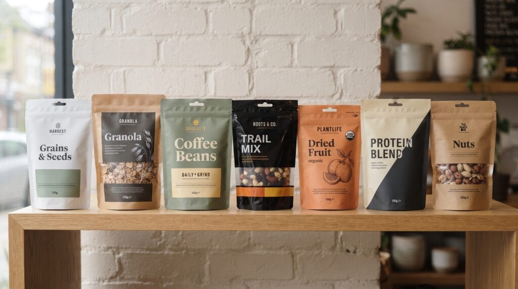
Strong pouch packaging design examples can show food brands how flexible packaging can become a powerful branding tool instead of simply a container. A pouch has a relatively large printable surface, which gives designers room to create clear typography, strong color systems, illustrations, ingredient imagery, product information, and visual hierarchy that remains easy to recognize on a busy retail shelf.
Pouches are commonly used for:
- Snacks
- Coffee
- Granola
- Nuts
- Dried fruit
- Pet treats
- Frozen food
- Spices
- Protein products
- Candy
Because many competing products use similar pouch structures, graphic design often becomes the main way to create differentiation.
The most effective pouch packaging design examples combine shelf impact with practical information, easy product recognition, and a visual system that can expand across several flavors or product varieties.
Why Pouch Packaging Design Examples Matter
Food shelves are crowded with color, photography, claims, logos, and competing visual styles.
Customers may only spend a few seconds looking at each product.
Packaging therefore needs to communicate important information quickly.
Strong pouch packaging can help shoppers identify:
- Brand
- Product type
- Flavor
- Key benefit
- Product category
The design should also remain recognizable from several feet away.
Studying different pouch packaging design examples can help brands understand how typography, color, layout, and materials influence shelf presence.
1. Pouch Packaging Design Example with Bold Color Blocking
One effective approach is to use a large area of strong color.
Instead of filling the pouch with many illustrations or product photographs, use one dominant background color and a few supporting elements.
For example, a snack brand could use:
- Sea Salt: Deep blue
- Barbecue: Burnt orange
- Cheese: Warm yellow
- Herb: Sage green
The basic design remains the same while the color changes between flavors.
This creates easy product recognition and a strong family appearance.
Keep the Layout Consistent
If color already provides variation, keep the remaining design stable.
Use the same:
- Logo position
- Product name
- Typography
- Illustration placement
- Information hierarchy
This makes the range look cohesive.
2. Pouch Packaging Design Example with Minimal Typography
Typography-led packaging can create a modern and confident appearance.
A minimal pouch might feature:
- Small logo
- Large product name
- Simple flavor label
- Limited colors
- Plenty of negative space
For example, a coffee pouch could use a large serif product name with a small origin description below it.
This approach works well when the brand wants to feel:
- Premium
- Editorial
- Modern
- Refined
One of the most useful pouch packaging design examples is a package where typography becomes the main branding device rather than decoration.
3. Pouch Packaging Design Example with Product Window
A transparent window lets customers see the product inside.
This can be effective for:
- Nuts
- Granola
- Candy
- Dried fruit
- Pasta
- Pet treats
The window itself can become part of the graphic design.
Instead of using a standard rectangle, consider:
- Circle
- Arch
- Leaf shape
- Fruit silhouette
- Geometric opening
The window adds visual interest while also communicating transparency.
Keep the Window Practical
Do not make the opening so large that it weakens the graphic layout.
You still need enough printed area for:
- Brand
- Product name
- Ingredients
- Nutrition information
- Required labeling
Balance visibility with communication.
4. Pouch Packaging Design Example with Illustrated Ingredients
Illustrations can make food packaging feel distinctive and approachable.
Instead of using realistic photography, consider illustrations of:
- Fruits
- Nuts
- Herbs
- Vegetables
- Coffee beans
- Grains
The style should match the brand personality.
For example:
- Fine botanical illustration can feel premium.
- Simple flat illustration can feel modern.
- Hand-drawn artwork can feel artisanal.
Strong pouch packaging design examples often use illustration consistently across an entire product family.
5. Pouch Packaging Design Example with Natural Kraft Packaging
Kraft pouches can work well for food brands that want a natural, handmade, or organic appearance.
The brown paper surface can be combined with:
- Black typography
- White labels
- Green accents
- Simple illustrations
This approach is often used for:
- Granola
- Tea
- Coffee
- Nuts
- Spices
However, using kraft material alone does not automatically communicate sustainability.
Any environmental claims should accurately reflect the packaging material and production process.
6. Pouch Packaging Design Example with Premium Matte Finish
A matte pouch can create a more refined visual appearance.
Matte surfaces can make:
- Dark colors
- Neutral palettes
- Metallic accents
- Minimal typography
feel especially sophisticated.
A premium coffee or chocolate brand could combine a black matte pouch with a simple cream wordmark.
The design can feel luxurious without requiring complex graphics.
This is one of the pouch packaging design examples where material and finish contribute heavily to brand perception.
7. Pouch Packaging Design Example with Oversized Product Names
Large typography helps products remain visible at a distance.
For example, instead of placing:
ROASTED ALMONDS
in small text beneath a logo, the product name could become the dominant visual element.
This works especially well for modern brands that want packaging to feel direct and energetic.
Use supporting text more quietly.
A simple hierarchy might be:
- Product name
- Brand
- Flavor
- Benefit
- Product details
Clear hierarchy improves both shelf impact and readability.
Also Read: Packaging Design Strategy for Better Shelf Impact and Branding
8. Pouch Packaging Design Example with Simple Food Photography
Food photography can still work within clean packaging.
The key is restraint.
Instead of covering the entire pouch with a large image, consider:
- Small ingredient photo
- Single hero product image
- Cropped close-up
- Photo within a simple frame
For example, a dried fruit pouch could use one carefully lit fruit photograph with large negative space around it.
This creates appetite appeal without making the design feel crowded.
9. Pouch Packaging Design Example with Geometric Graphic System
Geometric shapes can create a recognizable visual identity.
A brand might use:
- Circles
- Stripes
- Arches
- Blocks
- Diagonal lines
The same shapes can appear across all flavors.
For example, one bold diagonal band could change color depending on the product.
Geometric pouch packaging design examples can feel contemporary and work especially well for snack, coffee, and health-food brands.
10. Pouch Packaging Design Example with Flavor-Coded Labels
Flavor coding helps customers understand a product range quickly.
Keep most of the packaging the same and change a specific visual area.
You might vary:
- Color strip
- Illustration
- Flavor badge
- Background shape
For example:
- Original: Cream
- Spicy: Red
- Garlic: Green
- Cheese: Yellow
This makes shopping easier while protecting brand consistency.
11. Pouch Packaging Design Example with Vertical Layout
Most pouch packaging uses horizontal reading patterns.
A vertical layout can create visual distinction.
Consider placing the brand name or product title vertically along one side of the pouch.
This can make the package look more editorial and contemporary.
However, always test readability.
Customers should not need to rotate the pouch just to understand the product.
12. Pouch Packaging Design Example with Central Badge Layout
A central badge creates a strong focal point.
The badge could contain:
- Logo
- Product name
- Flavor
- Small illustration
This works especially well on pouches with:
- Patterned backgrounds
- Kraft materials
- Bold solid colors
The badge creates structure and prevents the design from feeling too scattered.
13. Pouch Packaging Design Example with Minimal Black and White
Black-and-white packaging can feel dramatic and premium.
A monochrome system can be useful for:
- Coffee
- Specialty snacks
- Gourmet ingredients
- Premium confectionery
Add one accent color if flavor differentiation is necessary.
A minimal black-and-white system can become highly recognizable when most competitors use bright colors.
This is why contrast with the competitive environment matters when choosing pouch packaging design examples for inspiration.
14. Pouch Packaging Design Example with Handcrafted Visual Style
Food brands that focus on handmade production can use a more tactile aesthetic.
Elements might include:
- Handwritten typography
- Rough illustration
- Textured background
- Stamp-style graphics
This works for:
- Artisan snacks
- Small-batch coffee
- Bakery products
- Spices
The goal is to communicate craft without making the pouch appear messy or unprofessional.
Use handmade elements selectively.
15. Pouch Packaging Design Example with Clean Health-Focused Design
Health and wellness food brands often need to communicate several product benefits.
Examples include:
- High protein
- Low sugar
- Vegan
- Gluten free
- Organic
Avoid placing every claim in a large badge.
Instead, create a hierarchy.
For example:
Brand
Protein Granola
Chocolate Almond
Small row of key benefit icons
This creates a cleaner presentation.
A strong pouch packaging design examples approach keeps health information visible without allowing claims to overwhelm the brand.
Also Read: How to Keep Packaging Design Consistency Across Product Lines
Use Clear Front-of-Pack Hierarchy
The front of a pouch should quickly answer:
What is this?
A clear structure might include:
- Brand
- Product
- Flavor
- Main benefit
- Supporting visual
Secondary information can remain smaller.
Do not make every element compete for attention.
Shelf impact often depends on choosing one primary message.
Design the Back of the Pouch Carefully
The back panel is usually more functional, but it should still feel connected to the front.
Organize:
- Product description
- Ingredients
- Nutrition information
- Preparation instructions
- Storage instructions
- Contact details
- Barcode
Use clear spacing and readable typography.
The back should not feel like an unrelated document.
Carry over the same:
- Colors
- Fonts
- Icons
- Illustration style
Good packaging design continues around the entire product.
Choose Materials That Support the Brand
Material affects both appearance and function.
Options may include:
- Glossy flexible film
- Matte film
- Kraft laminate
- Clear film
- Metallized material
The right choice depends on:
- Product protection
- Shelf life
- Moisture
- Light exposure
- Printing
- Shipping
- Brand positioning
Visual design and structural requirements should be developed together.
Do not choose material based only on appearance.
Create a Scalable Product Family
Food brands often introduce new flavors over time.
Build packaging that can grow.
Keep consistent:
- Logo placement
- Typography
- Label structure
- Core graphic language
Change selected elements such as:
- Flavor colors
- Ingredient illustrations
- Product names
A scalable pouch packaging design examples system allows customers to recognize both the brand and individual products quickly.
Test Pouch Packaging on a Real Shelf
A design can look impressive in a presentation but disappear in retail.
Print prototypes and test them beside competing products.
Check:
- Brand recognition
- Product readability
- Color contrast
- Visual hierarchy
- Flavor distinction
View the packaging from several distances.
Ask whether customers can understand the product without picking it up.
Real-world testing is essential.
Common Pouch Packaging Design Mistakes
Adding Too Much Information
Do not turn the front panel into a complete product specification.
Using Too Many Fonts
Two main typefaces are often enough.
Creating Weak Flavor Differentiation
Customers should quickly recognize each variation.
Ignoring Shelf Context
Always compare the package with competitors.
Using Small Typography
Important information needs to remain readable.
Choosing Style Over Product Clarity
Customers still need to understand what they are buying.
Forgetting Packaging Function
Resealing, storage, barrier protection, and production are all important.
Pouch Packaging Design Checklist
Before finalizing the packaging, check that you have:
- Defined the target customer
- Researched competing products
- Created a clear visual concept
- Established front-of-pack hierarchy
- Selected readable typography
- Defined brand colors
- Created flavor differentiation
- Chosen appropriate illustration or photography
- Considered a product window
- Selected suitable materials
- Reviewed pouch size and shape
- Designed the back panel
- Checked required information
- Created scalable product-family rules
- Tested shelf visibility
- Checked readability from a distance
- Tested physical prototypes
- Reviewed printing limitations
Good packaging should work visually and practically.
Also Read: Creative Soap Packaging Ideas That Make Your Brand Stand Out
Final Thoughts
The strongest pouch packaging design examples show that better shelf appeal does not require filling every available space with graphics. Clear hierarchy, recognizable colors, confident typography, thoughtful materials, and one distinctive visual idea can create a much stronger result.
Start by defining the personality of the food brand.
Then choose the elements that communicate that personality most clearly.
You might use bold color blocking, clean typography, ingredient illustrations, transparent windows, kraft materials, or a simple geometric system.
Keep the product easy to understand.
Build clear flavor differentiation.
Test the design next to real competitors.
Most importantly, think beyond one individual pouch.
A successful pouch packaging design examples system should support an entire product family and remain recognizable as the brand introduces new varieties.
When graphic design, materials, information hierarchy, and practical packaging requirements work together, pouch packaging can become a strong brand asset that improves shelf visibility, strengthens recognition, and makes food products more appealing to customers.
For high-quality fonts to boost your income, check out Letter Crafted. Our professional fonts are perfect for branding, marketing, and content creation. So, don’t miss this opportunity.