
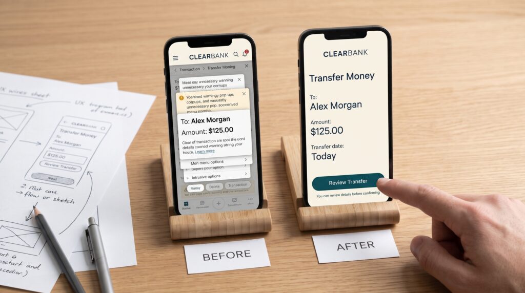
Banking app UX mistakes can make routine tasks feel uncertain. A customer may struggle to find a recent transaction, misunderstand a transfer status, or hesitate before confirming a payment. Even when an app looks polished, unclear labels and confusing feedback can undermine the experience.
For product teams, improving banking UX means looking beyond individual screens. Each journey should help people understand where they are, what information they need, and what will happen next. This guide explores ten common design mistakes and practical ways to address them, from onboarding and navigation to payment confirmation and account recovery.
1. Making Banking App Onboarding Too Complicated
A new customer may need to provide personal details, verify their identity, and set up access before using the app. When all of those requirements appear at once, the process can feel longer and more confusing than it needs to be.
One of the most common banking app UX mistakes is asking for information without explaining why it is needed. Users may hesitate when they encounter unfamiliar fields or do not know how many steps remain.
How to fix the onboarding experience
Break onboarding into clear stages and explain the purpose of each request. Use concise progress labels such as “Personal details,” “Identity verification,” and “Account setup.”
Allow customers to review information before submission. If they cannot complete a step immediately, explain whether their progress is saved and how they can return.
Test the flow with realistic interruptions, including a user who needs to locate a document or switch devices.
2. Hiding Important Tasks in Navigation
Customers often open a banking app with a specific goal like checking a balance, transferring money, reviewing a transaction, or finding a card setting. If those actions sit behind unclear menu labels, completing a simple task takes more effort.
Navigation problems are especially noticeable when similar actions appear in different places or use inconsistent terminology.
How to fix banking app navigation
Organize navigation around common customer tasks. Use labels people can understand, such as “Transfer,” “Cards,” and “Statements,” where those names accurately describe the destination.
Keep primary destinations consistent across related screens. Provide a clear way to return without losing information already entered.
Example: A customer who opens a transaction from an account list should be able to return to that list without losing their position or selected date range.
3. Overloading the Banking App Dashboard
A dashboard may need to show several accounts, recent activity, alerts, and shortcuts. However, placing every feature at the same visual priority makes it harder to identify what matters.
This is one of the banking app UX mistakes that can affect both new and experienced users. A busy screen forces people to sort through competing information before they can begin.
How to fix dashboard hierarchy
Prioritize the information and actions most relevant to the customer’s immediate context. Group related accounts, distinguish current information from promotional content, and give important alerts a clear purpose.
Use spacing, headings, and typography to create an order of attention. A low-priority offer should not visually compete with an urgent account notice.
Allow for different account situations. A customer with one account and a customer with several accounts may need different levels of detail.
4. Using Unclear Transaction Labels
Transaction names can be difficult to interpret when they contain abbreviations, unfamiliar business names, or incomplete descriptions. A customer may recognize the purchase but still feel unsure whether an entry belongs to them.
Confusing transaction details create avoidable questions and make account reviews more difficult.
How to fix transaction clarity
Show the clearest available description alongside the amount, date, and transaction status. On the detail screen, explain additional fields in plain language where possible.
Distinguish pending activity from completed activity. If information may change after processing, communicate that without suggesting an outcome the system cannot confirm.
Provide a clear route to report or ask about a transaction. The customer should not have to search through unrelated account settings to find help.
Also Read: Website Header Design Ideas for a Strong First Impression
5. Making Money Transfers Hard to Review
Money transfers involve several details that users need to verify. An unclear recipient name, hidden fee, or poorly organized review screen can make a customer uncertain at the most important moment.
Among banking app UX mistakes, weak transfer review is particularly concerning because the user needs to understand the consequences before confirming.
How to fix the transfer review screen
Present the recipient, destination account details, amount, applicable fees, and expected processing information in a clear summary.
Make it easy to return and correct a field without re-entering everything. Use a confirmation button that describes the action, such as “Confirm transfer,” when that accurately reflects what happens next.
After submission, show the status the system can actually confirm. If processing is still underway, say so and explain where to check for updates.
6. Showing Vague or Misleading Error Messages
A message such as “Something went wrong” tells the customer very little. It does not explain whether information was saved, whether a transfer went through, or what to do next.
Vague feedback can lead users to repeat an action unnecessarily or abandon a task.
How to fix banking app error messages
Explain the problem in plain language and place the message near the affected action or field. Where possible, provide a specific next step.
For a form field, identify what needs correction. For a connection interruption, preserve valid entries and explain whether the app can determine the transaction status.
Avoid claiming that a payment failed when its status is unknown. Instead, direct the customer to check the appropriate activity or status screen before attempting another transfer.
7. Making Authentication and Account Recovery Confusing
A secure login experience also needs to be understandable. Customers may change devices, forget credentials, or lose access to a verification method.
One of the banking app UX mistakes teams can overlook is designing the successful login path carefully while leaving recovery unclear.
How to fix authentication UX
Explain the available sign-in methods and provide a visible path for users who cannot access their usual method.
Guide customers through recovery with clear progress, realistic expectations, and a way to contact support when automated steps are insufficient. Avoid revealing sensitive account details unnecessarily.
Security requirements should be designed with the bank’s security and compliance teams. The interface can help by explaining the purpose of a step and what the customer should expect next.
8. Designing Banking App Content Without Accessibility in Mind
A banking app may be used in bright light, with enlarged text, or through assistive technology. If essential information depends on tiny text, subtle color differences, or unlabeled controls, some customers may struggle to complete routine tasks.
Accessibility problems can appear across the entire journey, including forms, charts, transaction lists, and confirmation screens.
How to fix accessibility barriers
Use clear text labels, readable contrast, and layouts that accommodate larger text. Do not rely on color alone to show an error, selected state, or account status.
Check that controls have understandable names and that the reading order makes sense with assistive technology.
Test important tasks with people who use different interaction methods. Finding a transfer button is only part of the task; the customer must also be able to review the details and understand the result.
Also Read: Website Footer Design Ideas for Better Navigation
9. Hiding Help Until a Customer Is Already Stuck
Banking questions often arise in context. A customer may need to understand a transfer status, locate a statement, or resolve an authentication problem.
When help appears only in a distant menu, the customer must leave the task and repeat their situation elsewhere.
This is one of the banking app UX mistakes that can make an otherwise simple journey feel unsupported.
How to fix in-context support
Offer help close to complex decisions. A short explanation near a transfer field or a link beside an unfamiliar status can answer a question without interrupting the whole process.
When escalation is needed, provide clear contact options and explain what information the customer may need to share. Avoid asking them to send sensitive credentials through a support message.
If the user leaves a form to read help, make returning to the task straightforward and preserve their progress where appropriate.
10. Testing Banking App Screens Without Testing Complete Journeys
A dashboard may perform well in isolation while the full transfer journey remains confusing. Problems often appear between screens, a selection disappears, a review page uses different wording, or a status message does not match the customer’s expectation.
Evaluating complete journeys helps product teams find these gaps.
How to fix banking app UX testing
Create realistic tasks with a clear goal. Ask a participant to find a recent transaction, set up a transfer, review its details, and explain what they expect to happen after confirmation.
Include situations beyond the ideal path. Test an interrupted connection, an unavailable verification method, and an entered amount that needs correction.
Observe where participants pause and what they believe has happened. Then review the findings with design, engineering, support, and security stakeholders before deciding how to improve the flow.
How to Prioritize Banking App UX Mistakes
A product team may find more issues than it can address at once. Prioritize banking app UX mistakes by considering their effect on customer understanding, task completion, and the effort required to recover.
Start with journeys where confusion can have significant consequences, such as confirming a transfer or responding to an uncertain transaction status.
Then examine issues that repeatedly prevent customers from finding information or getting help. Group related problems so the team can improve the underlying journey rather than patching each screen separately.
For each change, define what the team wants to learn. A navigation revision, for example, can be tested by observing whether customers find and complete a specific task without assistance.
Also Read: Website Layout Inspiration for Beautiful and Functional Pages
Conclusion – Build a Clearer Banking Experience
Fixing banking app UX mistakes begins with understanding what customers need at each step. Clear navigation, readable account information, helpful errors, and accurate transaction feedback all contribute to a more dependable experience.
Choose one important journey and review it from beginning to end. Include the moments when a customer needs to correct information, wait for an update, or ask for help.
When the interface explains what is happening and supports the next action, customers can manage everyday banking tasks with greater confidence.
For high-quality fonts to boost your income, check out Letter Crafted. Our professional fonts are perfect for branding, marketing, and content creation. So, don’t miss this opportunity.