
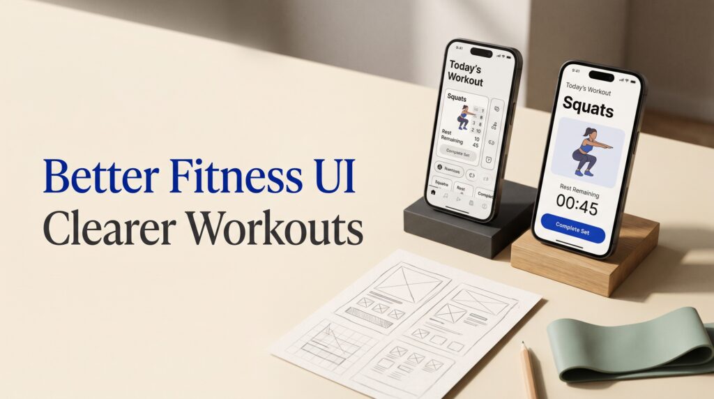
Fitness app UI design mistakes can turn a simple workout into a frustrating experience. A user might struggle to find their next exercise, lose track of a rest timer, or misunderstand what a progress chart shows. Even an attractive interface can get in the way when the most useful information is difficult to see or actions are hard to complete.
Designing a better experience starts with understanding the moments around a workout. People need to choose an activity, follow instructions, record what they did, and review the result. This guide explores ten common interface mistakes and practical ways to fix them, using a fictional workout-tracking app as an example.
1. Overloading the Fitness App Dashboard
A dashboard often brings together workout plans, activity summaries, goals, and reminders. When every card uses a bright color or large number, users may struggle to identify what needs their attention.
One of the most common fitness app UI design mistakes is treating every metric as equally important. A person opening the app before a workout may care more about today’s session than a collection of weekly charts.
How to fix the dashboard
Start with the user’s most likely next action. Give today’s planned workout a clear position, then organize supporting information into understandable groups.
Use visual weight selectively. A prominent “Start workout” button can stand out without making every surrounding card equally bold.
Example: Show the workout name and estimated duration first, followed by a compact weekly summary. Place detailed history on a separate screen.
2. Making Workout Selection Difficult
A long list of activities can feel overwhelming when names, categories, and descriptions do not help users distinguish between them. People may need to open several workouts before finding one that fits their available time or equipment.
This problem becomes more noticeable when the app relies on decorative images but hides practical details.
How to fix workout discovery
Show useful information before users open a workout. Depending on the activity, this might include duration, equipment, and a short description of what the session involves.
Use clear categories and filters that match the app’s actual content. Allow users to remove filters easily and explain when a selection produces no results.
Example: A workout card could show “Full-body session,” “25 minutes,” and “Dumbbells” without requiring users to inspect a separate detail page.
3. Using Small Controls During Active Workouts
A button that looks elegant in a static mockup may become difficult to use while someone is moving, wearing gloves, or handling equipment.
Small pause, skip, and completion controls are fitness app UI design mistakes because they interrupt the activity at the moment users need the interface to be easiest to operate.
How to fix workout controls
Give primary actions enough room and separate them from controls with different consequences. Make the current exercise and the next action easy to identify at a glance.
Avoid placing “End workout” beside a frequently used control without a clear distinction. If ending a session could discard information, explain the result and offer an appropriate confirmation.
Example: Place “Complete set” as the main action and keep secondary options in a clearly labeled menu.
4. Making Exercise Instructions Hard to Follow
An exercise screen may include a video, written directions, repetitions, and rest information. If those elements compete for attention, users can lose track of what to do next.
Unfamiliar names create an additional challenge. A person may recognize the movement but not the term used in the app.
How to fix exercise screens
Show the exercise name, target activity, and immediate action in a predictable order. Pair demonstrations with concise written instructions so users can choose how to review them.
Keep important details visible while the session is active. If the demonstration requires sound or a connection, explain the available alternative.
Example: Display “Squat,” the planned sets and repetitions, and a short preparation note before the user begins. Allow them to revisit the demonstration without losing their session.
Also Read: Mobile UI UX Design Tips for Better Notifications and Alerts
5. Showing Progress Without Enough Context
Numbers can look impressive on a dashboard while leaving users unsure what they represent. A chart without clear dates, units, or labels can be difficult to interpret.
These fitness app UI design mistakes often come from prioritizing visual appeal over explanation. Users need to know what was measured before they can understand whether a change matters to them.
How to fix progress displays
Label the metric, time period, and units. Explain whether a value represents a completed activity, an estimate, or a user-entered figure.
Give users an accessible way to review the underlying information. If the app lacks enough data for a chart, say so rather than showing a misleading empty graphic.
Example: Use “Workouts completed this week” instead of a number beside an unexplained icon.
6. Treating Every User’s Goal the Same Way
A fitness app may serve people with different interests, schedules, abilities, and reasons for using it. An interface built around only one type of goal can make other users feel as though the app was not designed for them.
For example, a person may want to record enjoyable walks rather than follow a demanding training schedule.
How to fix goal-setting screens
Let users choose relevant goals and adjust them when circumstances change. Explain what a goal tracks and how the app calculates progress.
Avoid presenting a missed target as a personal failure. Use neutral feedback and provide a clear way to revise the plan.
Example: Offer “Change weekly goal” alongside the current progress display, rather than hiding goal settings in a distant account menu.
7. Making Rest Timers Difficult to Understand
A rest timer is useful only when the user can tell whether it is running, paused, or finished. Small text, unclear icons, and unexpected automatic transitions can create confusion during a session.
These fitness app UI design mistakes are easy to miss when reviewing a screen without actually moving through a workout.
How to fix timer interfaces
Show the remaining time prominently and label the timer’s current state. Make pause, resume, and skip actions distinct.
Explain what happens when the timer reaches zero. If the app automatically moves to the next exercise, give users a way to understand or adjust that behavior.
Example: Display “Rest remaining” above the countdown, followed by a clearly labeled “Skip rest” control.
Test the experience with sound off as well as on.
8. Ignoring Readability and Accessibility
Fitness interfaces are used in different environments, including bright rooms and busy gyms. Thin text over photographs, color-only status indicators, and controls without clear labels can make the experience harder to use.
Accessibility needs attention across the journey, from choosing a workout to reading its summary.
How to fix accessibility barriers
Use readable text, sufficient contrast, and layouts that accommodate enlarged text. Pair color with labels or other visible indicators.
Ensure controls have meaningful names for assistive technology. Also check that instructions are available in more than one form when the workout includes audio or video.
Example: Mark a completed set with both a visual indicator and the word “Completed.”
Review the design in realistic conditions, including a small screen and reduced attention during activity.
Also Read: Homepage Design Structure for Better UX and Engagement
9. Interrupting Workouts With Excessive Notifications
Reminders, promotional messages, and achievement banners can compete with the task in progress. A notification that covers a timer or exercise instruction may force the user to stop and dismiss it.
This is one of the fitness app UI design mistakes that affects the rhythm of an otherwise well-designed session.
How to fix notification timing
Separate essential workout feedback from optional reminders and promotional content. Let users understand and control which notifications they receive.
Avoid interrupting active exercise screens with messages unrelated to the session. When an important alert appears, make its purpose and available actions clear.
Example: Save a new-feature announcement for the post-workout summary instead of displaying it over an active timer.
Check whether the app behaves consistently when notifications are disabled.
10. Treating the Workout Summary as an Afterthought
The session summary helps users understand what they completed and decide what to do next. A screen filled with unexplained numbers can make the end of a workout feel abrupt.
Other problems arise when users cannot correct an entry or tell whether their session was saved.
How to fix workout summaries
Show a concise overview of completed activity, duration, and any information the user chose to record. Distinguish recorded values from estimates.
Confirm the save status and provide a way to review or edit the session when the product supports it.
Example: Show “Workout saved,” the completed exercises, and an “Edit session” option before presenting optional sharing controls.
A useful summary closes the experience clearly and gives the user confidence that their work was recorded.
How to Find Fitness App UI Design Mistakes Through Testing
Individual screens may look consistent while the full workout journey remains confusing. Test the connected experience using realistic tasks.
Ask a participant to find a suitable session, review its requirements, complete a set, pause the timer, and finish the workout. Observe where they hesitate and what they expect each control to do.
Then test an interruption. The user might leave the app briefly, receive a call, or decide to change an exercise. Check what information remains available when they return.
To prioritize fitness app UI design mistakes, consider which problems block a task, create uncertainty, or force users to repeat work. Fix the underlying interaction and test it again.
Also Read: Agency Website Design Inspiration for Better UX and Conversion
Conclusion – Create a Clearer Fitness App Experience
The best fixes for fitness app UI design mistakes make the next action easier to understand. Clear workout details, readable progress, practical controls, and predictable feedback support users throughout a session.
Start with one complete journey and review it before, during, and after exercise. Use realistic content and test the interface in the conditions where people will use it.
A thoughtful fitness app gives users room to focus on their activity while keeping the information and controls they need close at hand.
For high-quality fonts to boost your income, check out Letter Crafted. Our professional fonts are perfect for branding, marketing, and content creation. So, don’t miss this opportunity.