
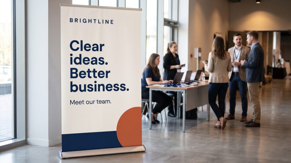
Business banner design ideas work best when they connect visual appeal with a clear message. Whether you are creating a website graphic, a social campaign, or a printed display, viewers should quickly understand the offer and what to do next. Strong typography, purposeful imagery, and thoughtful spacing help that information stand out.
A professional look does not require a complicated layout. A simple composition can communicate confidently when every element has a reason to be there. The following 25 concepts offer different directions you can adapt to your brand, content, and placement without relying on an existing company’s design.
Business Banner Design Ideas With Clear Typography
Begin with the words your audience needs to notice. A headline-led layout is useful when the message itself deserves attention and supporting imagery would add little.
1. One Bold Headline
Use a short headline as the largest element, supported by a single explanatory sentence. Keep the background restrained and place the action nearby. This approach suits a focused announcement with one main point.
2. Oversized Number
Build the composition around a meaningful number, such as an event date or package quantity. Explain its significance immediately. A large numeral creates hierarchy, but it should never leave viewers guessing what it represents.
3. Contrasting Font Pair
Combine an expressive heading with a simpler supporting typeface. Give each font a clear role and check that both remain readable. Repeat the pairing across related campaign graphics to create a recognizable visual connection.
4. Stacked Message
Arrange a compact headline across several deliberate lines. Break the words at natural pauses and align the supporting information beneath it. Test the line breaks carefully so the sentence still reads smoothly.
5. Question-Led Banner
Open with a question your audience recognizes, then explain the relevant offer. For a fictional bookkeeping service, the question could address organizing monthly records. Keep the answer specific rather than adding another vague statement.
These business banner design ideas depend on editing as much as styling. Shorten unnecessary wording before reducing the type size.
Business Banner Design Ideas Using Photography
Photography can show a product, introduce a person, or explain a setting. Choose images that contribute information rather than simply filling the available space.
1. Split Photo and Text
Place a photograph on one side and the message on the other. This gives text a predictable reading area while allowing the image to remain prominent. Adjust the proportions according to the amount of copy.
2. Product Close-Up
Feature one product against a quiet background, with a short benefit nearby. Select a viewpoint that shows a relevant detail. Leave enough space around the object so the design feels deliberate rather than tightly cropped.
3. Service in Action
Show a believable moment from the work being offered. A repair service might feature someone inspecting an item, while a studio could show a collaborative review. Keep the photograph connected to the written promise.
4. Portrait With Introduction
Pair a professional portrait with a name, role, and clear reason to connect. This can suit a speaker announcement or consultation service. Give the person’s information enough space without turning the banner into a biography.
5. Full-Width Image With a Text Panel
Use a photograph across the banner and place copy inside a solid panel. The panel protects readability when the image contains changing colors or details. Check that the crop still makes sense in different formats.
For photo-based business banner design ideas, decide where the words will sit before selecting the image. A beautiful photograph may not leave the space your message needs.
Business Banner Design Ideas With Shape and Color
Shapes can organize information and create a distinctive composition without photography. Establish a small palette and use contrast to guide attention.
1. Large Color Block
Give the headline a substantial block of brand color. Keep supporting text and the action visually separate. This direction works well when you want a confident graphic that remains straightforward to adapt.
2. Geometric Frame
Use a rectangle, circle, or angular shape to frame the main message. Keep the frame secondary to the words. Repeating its geometry in smaller details can make the composition feel connected.
3. Restrained Gradient
Introduce a subtle transition between related colors. Place text where the background remains clear and avoid excessive effects. A controlled gradient can add depth while allowing typography to lead.
4. Dark Background With a Bright Accent
Set readable light text against a dark field and reserve a stronger accent for one important element. The accent might highlight a date, label, or action. Avoid making every component equally vivid.
5. Neutral Layout With One Color
Use warm white, gray, or another restrained neutral as the foundation. Introduce one brand color through a heading or small shape. Careful alignment and spacing become especially noticeable in this minimal approach.
These business banner design ideas become easier to reuse when colors have assigned roles. Document which shade belongs to backgrounds, text, and accents.
Also Read: Holiday Graphic Design Styles That Inspire Better Designs
Business Banner Design Ideas for Specific Offers
An offer-led banner should explain what is available, who it suits, and the next step. Let the purpose determine the structure.
1. Service Package Summary
Present a package name, its main outcome, and a few essential inclusions. Keep the list short enough to scan. Direct viewers to a detailed page rather than trying to explain every condition inside the banner.
2. Product Launch Spotlight
Give a new product a clear visual introduction. Include its name, a useful distinguishing detail, and an appropriate action. If availability begins later, make that timing understandable instead of implying immediate access.
3. Event Announcement
Organize the event name, date, location, and registration action in a clear order. Use imagery only when it reinforces the occasion. Test whether someone can find the practical details without reading the entire composition.
4. Genuine Limited-Time Offer
Separate the offer from its deadline and applicable details. Make the conditions legible and direct viewers to fuller information when necessary. The visual urgency should reflect the actual promotion rather than an invented countdown.
5. Demonstration Preview
Show a small, relevant preview of a product or process. A template business could display one representative page beside a short explanation. Make clear what is included so the preview does not create the wrong expectation.
When adapting business banner design ideas for promotions, confirm the wording before building the layout. Late changes to dates or inclusions can disrupt the hierarchy.
Business Banner Design Ideas for Brand Recognition
Some banners introduce the business rather than promote an immediate purchase. They still need a clear purpose and an identifiable message.
1. Brand Statement
Combine a concise statement with a restrained visual signature. Explain what the business offers in language the audience understands. Let the logo support the message rather than expecting it to explain everything alone.
2. Process Preview
Use three simple stages to show how working with the business begins. Each stage needs a short label and a clear sequence. Include only steps that help viewers understand the experience.
3. Practical Commitment
Highlight a specific commitment the business can demonstrate, such as clearly defined consultation steps. Explain what customers receive. Avoid broad claims that sound impressive but give the audience nothing concrete to evaluate.
4. Team Introduction
Show a small team photograph with a focused message about its work. Keep names and role descriptions secondary unless they are essential. Choose a natural image that reflects how the business presents itself.
5. Coordinated Campaign Series
Create several banners using the same grid, typography, and palette. Give each version one message while retaining recognizable elements. This lets the campaign develop across placements without squeezing every idea into one graphic.
Across these business banner design ideas, consistency should make the collection easier to recognize while leaving room for different content.
How to Choose Business Banner Design Ideas for Your Project
Start with the placement and the intended action. A printed display viewed from a distance needs a different amount of information from a website banner.
Write the message in plain text first. Identify the headline, supporting detail, and next step. Then choose a concept that gives those elements suitable space.
Select business banner design ideas according to the assets you actually have. A strong portrait can support an introduction, while a clear product image may deserve its own spotlight.
Sketch two arrangements before polishing either. Compare which one communicates the purpose more directly.
Also Read: Festival Graphic Design Styles for Better Marketing Results
Make Typography and Calls to Action Work Together
The headline should establish the message, while the action tells viewers how to continue. Keep their relationship easy to understand.
Use specific wording such as “View the collection” or “Explore our services” when it accurately describes the destination. On a printed banner, provide a readable contact route appropriate to the setting.
Avoid designing a decorative element that resembles a button when it cannot be used. Keep practical details visible.
As you refine business banner design ideas, check the composition at its intended viewing size. Small text that looks comfortable while zoomed in may disappear in use.
Adapt and Review the Finished Banner
Different proportions need deliberate adjustments. A wide layout may become crowded when cropped into a narrow format.
Reposition elements rather than shrinking everything. Preserve the headline and essential information, then simplify supporting details where necessary.
Review these areas before delivery:
| Area | Question to ask |
|---|---|
| Message | Can viewers identify the main point quickly? |
| Hierarchy | Does the intended information stand out first? |
| Readability | Is the text clear at the final size? |
| Imagery | Does the image support the offer accurately? |
| Action | Is the next step understandable? |
| Consistency | Does the banner fit the wider brand? |
Keep editable files organized so future updates remain manageable.
Also Read: Summer Graphic Design Style Guide for Better Seasonal Branding
Conclusion – Create a Banner With a Clear Purpose
The most useful business banner design ideas give your message a structure. They help you decide what deserves attention, what can remain secondary, and how the audience should continue.
Choose one concept that fits the content and placement. Refine the wording, establish hierarchy, and test the result in a realistic setting.
A professional banner earns its clarity through those decisions. Start with a focused message and let the design make it easier to understand.
For high-quality fonts to boost your income, check out Letter Crafted. Our professional fonts are perfect for branding, marketing, and content creation. So, don’t miss this opportunity.