
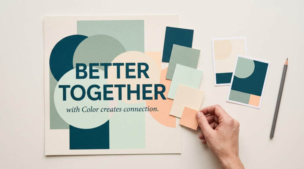
Color harmony in graphic design helps a palette feel connected while giving each element a clear role. It influences how a poster holds attention, how packaging communicates its character, and how a website separates important information from supporting details. A harmonious design can feel quiet, energetic, playful, or dramatic depending on the choices you make.
You do not need dozens of colors or complicated formulas to begin. Start with the message, choose a useful color relationship, and adjust the palette within an actual layout. This guide explains the main approaches and gives you practical exercises for creating combinations that look intentional and remain readable.
Understand Color Harmony in Graphic Design
Color harmony describes how colors work together within a composition. The relationship matters, but so do the amount, intensity, and placement of each color.
A palette can look attractive as a row of swatches and become uncomfortable when every shade fills an equal area. A strong accent may work beautifully on a small button yet overpower an entire background.
Think about color as part of the layout. Ask what should attract attention, what should provide breathing room, and which elements need separation.
Practical exercise: Apply the same three colors to one poster in different proportions. Compare which version communicates the headline most clearly.
Start With Hue, Saturation, and Value
Before building a palette, understand three useful ways to describe a color.
| Color property | What it describes | Practical adjustment |
|---|---|---|
| Hue | The color family, such as blue or orange | Change the overall color direction |
| Saturation | How vivid or muted the color appears | Soften or intensify a shade |
| Value | How light or dark the color appears | Create separation between elements |
These properties work together. Two colors can belong to different hue families yet look similar in lightness, making text difficult to distinguish from its background.
To improve color harmony in graphic design, try adjusting saturation or value before replacing the hue entirely. A muted green may fit your composition better than the vivid version you first selected.
Choose a Purpose Before Choosing a Palette
Begin with the design’s audience, content, and setting. A lively event poster and a detailed business report need different relationships between atmosphere and clarity.
Describe the intended impression using specific words. “Welcoming and informal” gives you more direction than “beautiful.”
Next, identify practical requirements. You may need to retain an existing brand color, accommodate photographs, or make several information categories distinguishable.
Avoid assuming that a color produces the same response in every situation. Its effect depends on the surrounding colors, imagery, wording, and audience.
Practical exercise: Write a two-sentence brief before opening your color picker. Use it to explain your choices later.
Build Color Harmony in Graphic Design With One Hue
A monochromatic palette develops one hue through changes in lightness and saturation. This approach gives you a connected starting point while leaving room for hierarchy.
For example, a blue palette could include a pale background, a medium-blue illustration, and deep-blue headings. The variations need enough separation to remain useful.
Watch for elements blending together. A limited hue range makes value differences especially important.
Practical exercise: Create a simple event card using three blue variations and a neutral. Make the title the clearest element without introducing another hue.
This approach to color harmony in graphic design is useful when you want a restrained palette and a manageable first experiment.
Also Read: Graphic Design Basics for Beginners Who Want to Design Better
Explore Neighboring Colors for a Connected Palette
An analogous palette uses neighboring hues on a color wheel. Depending on the wheel, an example might move through yellow, yellow-green, and green.
Because the hues sit close together, you can develop a flowing visual relationship. However, similar hues still need distinct roles and sufficient contrast.
Choose one dominant color and let the others support it. Adjust their values so the palette does not become a flat collection of equally intense shades.
Practical exercise: Design a garden workshop poster with a light neutral background, green supporting shapes, and a yellow accent.
Use darker text where needed. The palette’s connected appearance should support the information rather than make it harder to read.
Use Complementary Colors With Intentional Contrast
Complementary colors sit opposite each other on the color wheel you are using. In a traditional artist’s wheel, examples include blue and orange.
Different color models organize relationships differently, so treat the wheel as a starting framework rather than a guarantee of an attractive result.
Complementary combinations can create strong separation. If both colors are highly saturated and used in equal amounts, the effect may become visually demanding.
For color harmony in graphic design, try giving one color more space and using the other as a limited accent.
Practical exercise: Build a blue poster with a small orange callout. Compare it with a version using equal areas of both colors.
Try Split-Complementary and Triadic Relationships
A split-complementary palette begins with one hue and the two neighbors of its opposite hue. This gives you several color directions while avoiding a direct complementary pair.
A triadic palette uses three hues spaced evenly around a chosen color wheel. It provides variety but requires careful decisions about emphasis.
Neither approach means all three colors must appear equally often. Choose a lead color, assign supporting roles, and adjust intensity.
These methods can expand color harmony in graphic design when a two-color arrangement feels too limited.
Practical exercise: Create three geometric shapes using a triadic palette. Then introduce a neutral background and reduce the saturation of two colors. Observe how the hierarchy changes.
Assign Roles to Create Color Harmony in Graphic Design
A useful palette explains where each color belongs. Start with a background, a main text color, a supporting color, and an accent.
For a fictional creative workshop, you might choose warm ivory for the background, charcoal for text, muted blue for illustrations, and orange for key details.
Role-based decisions make the palette easier to repeat across different layouts. They also prevent every new element from introducing another shade.
You do not need a fixed percentage formula. Instead, inspect the composition and ask whether the important information receives enough attention.
Practical exercise: Write a one-line usage rule beneath every swatch before applying the palette to a second design.
Also Read: Contrast in Graphic Design for Better Typography
Balance Saturation and Neutral Space
A vivid palette can still feel organized when intense colors appear selectively. Likewise, a muted palette can contain energy through a small, stronger accent.
Review the saturation of your colors together. One unusually vivid shade may become the focal point even when its element is small.
Neutrals give the eye space between colorful areas. Their appearance also matters, a warm cream and a cool gray can create different relationships with the same accent colors.
When refining color harmony in graphic design, change one variable at a time. Reduce the intensity of a supporting shade, enlarge a neutral area, or move the accent.
Compare the results within the full layout.
Check Readability Alongside Color Harmony
A harmonious palette still needs to communicate. Text must remain distinguishable, and important states should not depend on color alone.
Inspect headings, captions, buttons, and small labels using their actual sizes. A combination that works for a large title may fail for fine print.
Pair color with wording, shapes, or symbols when it communicates meaning. For example, identify categories with labels rather than relying only on colored dots.
Reviewing a layout in grayscale can help reveal weak value separation, although it does not replace checking the actual color combinations.
Practical exercise: Test a pale accent behind body text. If reading requires effort, change the text or background before adjusting decoration.
Test Color Harmony in Graphic Design Across Formats
Colors need to work beyond the original mockup. Apply your palette to a wide banner, a narrow social graphic, and a text-heavy page.
Check what happens when photographs enter the composition. Their existing colors may compete with your accents or change which area draws attention.
For printed work, inspect a physical sample when possible. Screen appearance alone does not establish how the final material will look.
Testing color harmony in graphic design across formats helps you identify flexible choices. You may need an alternative background or a darker accent for certain applications.
Document those variations so they become controlled options rather than improvised replacements.
Fix Common Color Harmony Problems
When a palette feels uncomfortable, identify the specific issue before starting over.
If everything competes, reduce the saturation or area of supporting colors. If the design feels flat, strengthen value differences around important information.
If the palette looks disconnected, examine whether the colors share a useful relationship in warmth, intensity, or placement. Adjust one shade and compare again.
Too many colors can also make decisions harder. Remove a color and check whether the design loses anything important.
Improving color harmony in graphic design often involves subtraction and refinement. Keep versions of your experiments so you can judge the effect of each change.
Also Read: Free Graphic Design Software for Students and New Creators
Conclusion – Build a Palette You Can Explain
Color harmony in graphic design becomes easier when you connect color relationships with practical decisions. Choose a purpose, explore a manageable palette, and give each shade a role.
Then test the colors in real content. Review contrast, proportions, imagery, and different formats before treating the palette as finished.
Begin with one layout and a few deliberate choices. A successful palette should help you explain what the viewer notices, how the content stays readable, and why the colors belong together.
For high-quality fonts to boost your income, check out Letter Crafted. Our professional fonts are perfect for branding, marketing, and content creation. So, don’t miss this opportunity.