
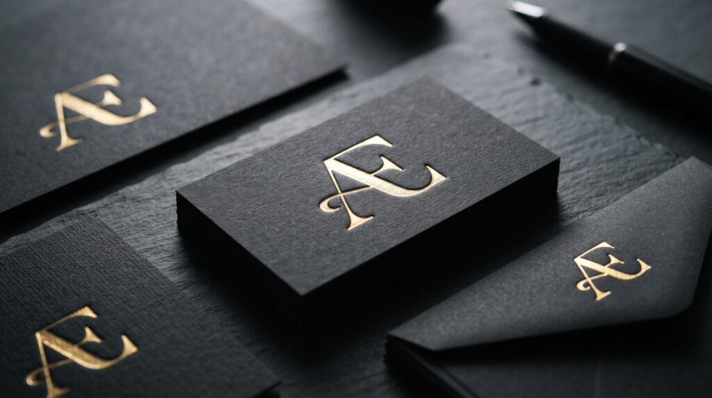
A professional lettermark logo design turns one or more initials into a simple, recognizable visual identity. Instead of relying on illustrations or complex symbols, a lettermark uses typography and carefully constructed letterforms to represent a company. This approach can be especially useful for businesses with long names, multiple words, or initials that are easier for customers to remember.
Creating an effective lettermark looks simple at first. You choose a few letters, combine them, and create a logo.
However, professional results require much more attention to typography, spacing, balance, geometry, scalability, and originality.
A good lettermark must look intentional rather than appearing like two letters placed next to each other.
This guide explains how to develop a lettermark logo design step by step and turn simple initials into a strong business identity.
What Is a Lettermark Logo Design?
A lettermark is a typography-based logo built from the initials or abbreviated name of a business.
For example, a company with a long three-word name might use the first letter from each word to create a compact logo.
A lettermark can contain:
- One letter
- Two initials
- Three initials
- Occasionally more letters
The goal is to simplify the brand name while maintaining recognition.
Lettermarks are particularly useful when the full company name is difficult to fit into small spaces.
They can work effectively across:
- Websites
- Business cards
- Packaging
- Social media
- Apps
- Signage
- Documents
- Merchandise
Because the design relies heavily on typography, every small detail matters.
When Should You Use Lettermark Logo Design?
Not every business needs a lettermark.
This logo style works particularly well when a company has a long or complicated name.
It can also work when the initials are naturally memorable.
Consider a lettermark when:
- The business name contains several words
- Customers already abbreviate the company name
- The initials form an interesting combination
- You need a compact brand symbol
- The business needs a professional or corporate identity
A lettermark can also complement a full wordmark.
For example, the complete company name may appear on a website header while the lettermark becomes the social profile image or favicon.
Start Lettermark Logo Design With the Brand Strategy
Before drawing letters, understand the business.
Ask:
- What does the company do?
- Who is the target customer?
- What personality should the brand communicate?
- Who are the competitors?
- Where will the logo appear?
- Should the brand feel traditional or modern?
- Should it feel premium, playful, technical, or approachable?
These answers affect your design decisions.
A financial consulting company may require a very different lettermark from a children’s clothing brand.
Logo style should follow brand strategy rather than personal preference.
Choose the Right Initials
The first practical step in lettermark logo design is determining which letters should appear.
Suppose a fictional company is named:
Northfield Creative Studio
You might explore:
- NCS
- NC
- N
- NS
Do not automatically assume every word needs representation.
Sometimes two letters create a cleaner symbol than three.
Sketch several alternatives before choosing the strongest combination.
Also consider how the initials sound when spoken. If customers may eventually refer to the company by its abbreviation, the initials should be reasonably memorable.
Explore Typography for Lettermark Logo Design
Typography strongly influences the personality of a lettermark.
Different type categories communicate different characteristics.
Serif Lettermark Logos
Serif letters can communicate:
- Tradition
- Authority
- Elegance
- Heritage
- Luxury
They can work well for:
- Law firms
- Fashion brands
- Hotels
- Financial businesses
- Premium products
Look carefully at the serif shapes because small details can influence the entire identity.
Sans Serif Lettermark Logos
Sans serif typography often feels:
- Modern
- Clean
- Professional
- Simple
- Contemporary
It is commonly used for:
- Technology companies
- Startups
- Creative studios
- Professional services
Geometric sans serifs can create structure, while humanist sans serifs may feel more approachable.
Script Lettermark Logos
Script lettering can add:
- Elegance
- Personality
- Movement
- Handcrafted character
It may work for:
- Beauty businesses
- Wedding brands
- Fashion
- Boutique products
However, readability needs special attention.
Highly decorative scripts can become difficult to recognize when reduced to small sizes.
Customize the Letterforms
One important difference between an ordinary abbreviation and professional lettermark logo design is customization.
Do not stop after typing the initials in a font.
Experiment with modifying:
- Stems
- Crossbars
- Curves
- Serifs
- Terminals
- Corners
- Counters
- Letter width
Even a small modification can make the logo more distinctive.
For example, you might extend one letter’s horizontal stroke so it interacts with another initial.
Alternatively, you could remove part of a letter while preserving enough information for recognition.
The goal is not to make every character strange.
One or two thoughtful modifications may be enough.
Combine Letters Carefully
Many lettermarks use overlapping or connected initials.
This can produce a compact symbol, but the combination must remain readable.
Common techniques include:
- Overlapping letters
- Sharing a vertical stem
- Sharing a crossbar
- Interlocking forms
- Stacking initials
- Connecting terminals
Sketch several arrangements.
One version might place letters side by side, while another overlaps them.
Avoid forcing letters together merely to make the logo look clever.
Each connection should improve the overall shape.
Also Read: Simple Circle Logo Design Ideas for Better Branding
Use Negative Space in Lettermark Logo Design
Negative space can create interesting relationships between initials.
One letter may appear inside another or emerge from the empty area between two forms.
For example, the space between two large letters might subtly create a third initial.
Negative space can make a logo more memorable because viewers discover a secondary idea.
However, subtlety matters.
The logo should still work even if someone does not immediately notice the hidden shape.
Never sacrifice readability simply to create a visual trick.
Pay Attention to Kerning and Spacing
Spacing can dramatically change how professional a lettermark feels.
Kerning refers to the space between individual letters.
Default font spacing may not work when initials are enlarged and used as a logo.
Study the visual space rather than relying entirely on numerical measurements.
Pairs such as:
- AV
- LT
- WA
- TA
may create unusual gaps because of their shapes.
Adjust spacing until the letters feel visually balanced.
For stacked or overlapping designs, check internal spacing as carefully as external spacing.
Create Visual Balance
Professional lettermark logo design should feel stable.
Visual balance depends on:
- Letter width
- Stroke thickness
- Negative space
- Overall silhouette
- Alignment
Two letters may technically have the same dimensions but still appear unbalanced because one has more visual weight.
For example, a bold “M” may feel heavier than a narrow “I.”
Adjust size and spacing based on visual perception rather than strict measurements alone.
Use a Grid Without Becoming Too Rigid
A grid can help organize letterforms.
You can use guides to control:
- Baselines
- Cap height
- Stroke alignment
- Angles
- Proportions
- Spacing
Geometric construction can create consistency.
However, optical corrections may still be necessary.
Perfect mathematical symmetry does not always look visually perfect.
Curved letters, for example, often extend slightly beyond flat alignment lines to appear equal in height.
Use geometry as a foundation, then refine visually.
Keep Lettermark Logo Design Simple
Lettermarks usually perform best when they remain relatively simple.
Avoid excessive:
- Decorative lines
- Shadows
- Textures
- Tiny details
- Complicated outlines
- Multiple effects
Remember that the logo may eventually appear at very small sizes.
A beautiful detail visible on a large presentation may disappear completely inside a social profile picture.
Ask whether each element improves recognition.
If it does not, consider removing it.
Test Your Lettermark at Small Sizes
Scalability is essential.
Shrink the logo significantly.
Test it as:
- Favicon
- Social avatar
- Mobile navigation logo
- App icon
- Business card mark
Can you still distinguish the initials?
Do narrow gaps disappear?
Do thin strokes become invisible?
A professional lettermark logo design should maintain its fundamental character when reduced.
Sometimes this requires creating a simplified small-size variation.
Create Black-and-White Versions First
Before experimenting extensively with color, test the logo in black and white.
This helps you evaluate the actual structure.
Without color, you can focus on:
- Shape
- Balance
- Legibility
- Negative space
- Proportion
If a lettermark only looks effective because of a gradient or special effect, the underlying design may need refinement.
Strong logos generally work in a single color.
Also Read: Logo Variation Tips for New Businesses and Digital Products
Choose Colors That Support the Brand
Once the structure works, explore color.
Color should reflect the brand strategy.
For example:
- Blue may support professional or technology-oriented identities.
- Black can create an elegant or authoritative impression.
- Green may support environmental or wellness positioning.
- Bright colors may work for energetic creative brands.
Avoid choosing colors only because they are currently fashionable.
Also prepare color variations for light and dark backgrounds.
Develop a Lettermark Logo Design System
A logo should rarely exist as one isolated file.
Create a small identity system containing several configurations.
For example:
Primary Logo
Lettermark plus full business name.
Secondary Logo
Alternative horizontal or stacked arrangement.
Lettermark Symbol
Initials only.
Small Icon
Simplified version for favicons or profile images.
These variations give the brand greater flexibility.
All versions should maintain consistent proportions, typography, and visual character.
Pair the Lettermark With a Wordmark
Some audiences may not immediately know what unfamiliar initials represent.
Pairing the symbol with the full company name can solve this problem.
During early stages of brand awareness, use:
Lettermark + Business Name
more frequently.
As recognition grows, the initials may eventually function independently in certain contexts.
Pay attention to the relationship between symbol and wordmark.
They should feel like parts of the same identity rather than two unrelated designs.
Create Lettermark Logo Design for Different Industries
The same initials can communicate very different personalities depending on the design approach.
Luxury Brands
Try:
- Refined serif typography
- High contrast strokes
- Generous spacing
- Monochrome palettes
Technology Companies
Explore:
- Geometric sans serif forms
- Modular structures
- Simplified shapes
- Modern letter connections
Creative Studios
Experiment with:
- Unexpected compositions
- Custom letterforms
- Bold proportions
- Asymmetry
Corporate Businesses
Focus on:
- Clarity
- Stability
- Professional typography
- Conservative proportions
Understanding industry expectations is helpful, but avoid copying visual conventions so closely that the brand becomes generic.
Use Mockups to Test the Logo
A logo might look excellent on a blank artboard but weaker in real applications.
Test your lettermark logo design using realistic scenarios.
Place it on:
- Website headers
- Business cards
- Storefront signage
- Product packaging
- Mobile screens
- Social profiles
- Documents
Mockups reveal scale and spacing problems that may be difficult to notice during isolated logo development.
However, do not let an attractive mockup hide weaknesses in the logo itself.
The flat logo should still work independently.
Common Lettermark Logo Design Mistakes
Avoiding common problems can make the design process more efficient.
Using an Unmodified Font
Simply typing initials in a standard font may result in a generic identity.
Look for opportunities to customize the forms.
Overlapping Letters Without Purpose
Interlocking letters should improve the symbol rather than make it confusing.
Making the Logo Too Decorative
Complex details can reduce scalability.
Ignoring Kerning
Poor spacing is especially noticeable in typography-based logos.
Using Extremely Thin Lines
Thin strokes may disappear at small sizes.
Creating Unreadable Initials
Creativity should not destroy recognition.
Copying Famous Monograms
Study successful marks for principles, not forms you can reproduce.
Originality is essential for building a distinctive identity.
Professional Lettermark Logo Design Workflow
A simple workflow can help organize your project.
1. Research the Brand
Understand the business, audience, competitors, and personality.
2. Choose Initials
Determine which letters create the strongest abbreviation.
3. Sketch Several Concepts
Explore combinations before opening design software.
4. Test Typography
Compare serif, sans serif, and other relevant styles.
5. Customize the Letters
Modify shapes to create originality.
6. Refine Spacing
Adjust kerning, alignment, and negative space.
7. Simplify
Remove unnecessary details.
8. Test Scalability
Check both large and small applications.
9. Explore Color
Develop appropriate brand variations.
10. Create Logo Variations
Prepare primary, secondary, monochrome, and icon versions.
Following a structured process prevents you from jumping too quickly into decorative styling.
Lettermark Logo Design Checklist
Before finalizing the logo, ask:
- Are the initials easy to recognize?
- Does the design fit the brand personality?
- Is it distinctive from competitors?
- Is the spacing visually balanced?
- Do overlapping letters remain readable?
- Does the logo work in black and white?
- Does it remain clear at small sizes?
- Does it work on both light and dark backgrounds?
- Is the overall silhouette memorable?
- Are decorative details necessary?
- Does the typography feel intentional?
- Can the symbol work without the full business name?
- Is there a simplified icon version?
- Does it work across digital and printed applications?
Use these questions before approving the final design.
Also Read: Best Luxury Logo Color Ideas for Premium Brand Identity
Final Thoughts on Lettermark Logo Design
A strong lettermark logo design may look simple, but simplicity requires careful decision-making.
Every curve, stroke, gap, connection, and proportion contributes to the final impression.
Start with the business strategy rather than immediately combining initials. Understand what the company needs to communicate and which visual personality will support that message.
Then explore typography, sketch different letter arrangements, experiment with negative space, and customize the strongest concept.
Keep readability and scalability at the center of the process.
The best lettermark logo design does not need complicated effects to look professional. Thoughtful typography, balanced spacing, distinctive construction, and a clear visual concept are often enough.
Finally, test the design in realistic applications before considering it complete.
A lettermark should work just as confidently on a small mobile screen as it does on large signage.
When typography, strategy, simplicity, and originality work together, a few initials can become a memorable symbol capable of representing a business for years.
For high-quality fonts to boost your income, check out Letter Crafted. Our professional fonts are perfect for branding, marketing, and content creation. So, don’t miss this opportunity.