
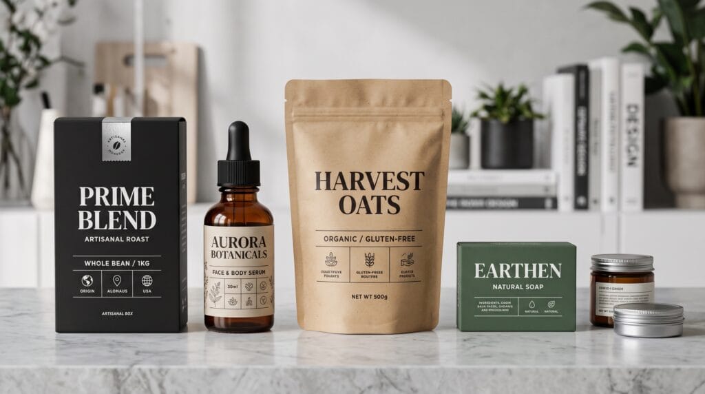
Graphic design for packaging plays a vital role in influencing purchasing decisions. Long before customers compare features or read product descriptions, they notice packaging. A well-designed package immediately communicates quality, personality, and value while guiding the customer’s eyes toward the most important information. This is where visual hierarchy becomes essential.
Visual hierarchy is the arrangement of design elements according to their level of importance. It helps customers identify the brand name, understand the product, recognize key benefits, and make buying decisions within seconds. Without a clear hierarchy, even attractive packaging can confuse shoppers and reduce product visibility on crowded shelves.
For designers, mastering graphic design for packaging means combining branding, typography, color, imagery, layout, and structure into a cohesive system that communicates clearly across both physical and digital shopping environments.
Why Graphic Design for Packaging Matters
Packaging serves as both a protective container and a powerful marketing tool. Whether products are displayed in retail stores or online marketplaces, packaging often creates the first impression customers have of a brand.
Effective graphic design for packaging helps businesses:
- Increase shelf visibility
- Strengthen brand recognition
- Communicate product value
- Build customer trust
- Differentiate products from competitors
- Improve readability
- Support premium pricing
- Encourage repeat purchases
Good packaging does more than look attractive, it tells a visual story that guides purchasing decisions.
Understanding Visual Hierarchy in Graphic Design for Packaging
Visual hierarchy determines what customers notice first, second, and third.
A successful package usually communicates information in this order:
- Brand name
- Product name
- Product category
- Primary benefit
- Supporting information
- Ingredients or specifications
- Legal information
When everything receives equal emphasis, nothing stands out.
Why Hierarchy Improves Communication
Consumers often spend only a few seconds looking at a product before deciding whether to investigate further.
Clear hierarchy allows shoppers to quickly understand:
- What the product is
- Who makes it
- Why it is different
- Whether it matches their needs
This is one of the most important principles in graphic design for packaging.
Typography in Graphic Design for Packaging
Typography is usually the strongest element of package hierarchy.
Designers should carefully organize:
- Brand logo
- Product title
- Headlines
- Product descriptions
- Nutritional facts
- Instructions
- Legal copy
Different font sizes, weights, and spacing help customers process information naturally.
Typography Best Practices
Effective typography includes:
- Readable font choices
- Strong headline contrast
- Consistent font families
- Proper line spacing
- Balanced letter spacing
- Clear alignment
Too many typefaces create confusion.
Professional graphic design for packaging usually limits typography to two or three complementary font families.
Color Hierarchy in Graphic Design for Packaging
Color influences attention before customers read any text.
Primary colors highlight:
- Brand identity
- Product category
- Emotional appeal
Secondary colors organize supporting information.
Accent colors draw attention toward:
- Promotions
- New products
- Limited editions
- Certifications
- Product benefits
Psychology of Color
Different colors communicate different emotions.
Examples include:
- Blue = trust
- Green = natural
- Black = luxury
- Red = excitement
- Yellow = optimism
- White = simplicity
Successful graphic design for packaging uses color intentionally instead of decorating randomly.
Layout and Composition in Graphic Design for Packaging
Layout determines how visual elements work together.
Important considerations include:
- Grid systems
- Alignment
- Margins
- White space
- Image placement
- Typography positioning
A strong layout creates natural eye movement.
Using White Space Effectively
White space is not empty space.
It improves:
- Readability
- Premium appearance
- Focus
- Organization
- Visual breathing room
Luxury brands often rely heavily on white space because it creates sophistication.
Many successful examples of graphic design for packaging use fewer visual elements rather than adding more.
Also Read: Graphic Design Layout Ideas How to Use White Space Better
Branding Consistency in Graphic Design for Packaging
Packaging should immediately connect with the overall brand identity.
Consistency includes:
- Logos
- Colors
- Typography
- Photography
- Illustration style
- Icons
- Graphic patterns
- Tone of voice
Customers should recognize the brand whether they see:
- Packaging
- Website
- Advertisement
- Social media
- Mobile app
Building Brand Recognition
Consistent packaging increases customer familiarity over time.
Brands with recognizable packaging often require less explanation because customers quickly identify them.
This makes branding one of the strongest aspects of graphic design for packaging.
Imagery in Graphic Design for Packaging
Images communicate product expectations instantly.
Depending on the product category, imagery may include:
- Product photography
- Lifestyle photography
- Illustrations
- Icons
- Textures
- Abstract graphics
The chosen style should support the overall branding.
Choosing Between Photography and Illustration
Photography works well when customers expect realism.
Illustration works well when brands want:
- Creativity
- Personality
- Simplicity
- Storytelling
The strongest graphic design for packaging selects imagery based on communication goals rather than trends.
Information Architecture in Graphic Design for Packaging
Customers should never struggle to find important information.
Organize content into logical sections such as:
- Brand
- Product
- Benefits
- Ingredients
- Instructions
- Certifications
- Warnings
Grouping related information improves comprehension.
Avoid Information Overload
Many packages include unnecessary text.
Instead:
- Use concise copy.
- Remove repetition.
- Highlight key benefits.
- Simplify technical language.
Clean information architecture makes graphic design for packaging easier to understand.
Sustainable Graphic Design for Packaging
Sustainability increasingly influences packaging design decisions.
Modern approaches include:
- Recyclable materials
- Reduced ink coverage
- Minimal printing
- Reusable packaging
- Eco-friendly messaging
- Simple construction
Visual hierarchy should remain strong while reducing unnecessary materials.
Sustainability Without Greenwashing
Design should accurately communicate environmental efforts.
Avoid exaggerated sustainability claims that customers cannot verify.
Trust remains an essential part of graphic design for packaging.
Packaging Design for Ecommerce
Many products are now discovered online before reaching physical stores.
Packaging must work well:
- On product thumbnails
- On mobile devices
- In social media posts
- During unboxing
- In influencer videos
Simple, recognizable packaging performs better on smaller screens.
Digital Shelf Visibility
Online marketplaces create different challenges.
Packages need:
- Strong contrast
- Readable typography
- Recognizable branding
- Simple composition
These factors make graphic design for packaging equally important in ecommerce.
Also Read: Festival Graphic Design Styles for Better Marketing Results
Common Mistakes in Graphic Design for Packaging
Avoid these frequent problems:
- Weak hierarchy
- Too many fonts
- Poor readability
- Overcrowded layouts
- Inconsistent branding
- Low color contrast
- Excessive decoration
- Tiny product names
- Weak logo visibility
- Ignoring shelf testing
Design should prioritize communication before decoration.
How to Test Graphic Design for Packaging
Before production, evaluate packaging by asking:
- Is the product name readable?
- Does the hierarchy feel natural?
- Can customers identify the brand quickly?
- Is important information easy to scan?
- Does the package stand out beside competitors?
- Is typography readable from different distances?
- Does it work online and offline?
- Does it support the brand personality?
Testing reveals problems before expensive printing begins.
Best Tools for Graphic Design for Packaging
1. Adobe Illustrator
Industry-standard software for vector packaging artwork.
Best for:
- Packaging layouts
- Logo design
- Dielines
- Typography
- Print production
2. Adobe InDesign
Useful for packaging guidelines and multi-page product documentation.
Best for:
- Brand guidelines
- Packaging manuals
- Editorial layouts
- Print documents
- Product catalogs
3. Adobe Photoshop
Ideal for image editing and packaging mockups.
Best for:
- Product photography
- Retouching
- Mockups
- Texture creation
- Image compositing
4. Esko Studio
Professional packaging visualization software that allows designers to preview packaging in realistic 3D before production.
Best for:
- 3D packaging previews
- Structural visualization
- Label design
- Print validation
- Client presentations
5. ArtiosCAD
Industry-leading software for structural packaging and dieline creation.
Best for:
- Box structures
- Folding cartons
- Packaging prototypes
- Manufacturing files
- Production planning
6. Figma
Excellent for collaborative packaging concepts and presentation boards.
Best for:
- Team collaboration
- Mood boards
- Brand systems
- Packaging concepts
- Design reviews
7. Canva
Easy-to-use platform for quick packaging concepts and marketing mockups.
Best for:
- Beginners
- Product labels
- Marketing visuals
- Presentation mockups
- Brand kits
8. Blender
Useful for creating realistic packaging renders and promotional visuals.
Best for:
- 3D packaging
- Product rendering
- Marketing images
- Animation
- Ecommerce visualization
Practical Workflow for Better Graphic Design for Packaging
A structured workflow improves consistency.
- Research competitors.
- Define target customers.
- Establish brand positioning.
- Organize information hierarchy.
- Select typography.
- Build the color palette.
- Create layouts.
- Develop mockups.
- Test shelf visibility.
- Gather customer feedback.
- Finalize print files.
- Verify production quality.
Following this process helps designers avoid expensive revisions while producing stronger packaging.
Future Trends in Graphic Design for Packaging
Packaging continues evolving through:
- Smart packaging
- QR code integration
- Augmented reality
- Sustainable materials
- Personalized printing
- AI-assisted design
- Variable packaging
- Interactive labels
- Minimalist branding
- Premium tactile finishes
Designers who understand these developments will be better prepared for future branding projects.
Also Read: Graphic Design Tips That Make Your Work Look Professional
Final Thoughts on Graphic Design for Packaging
Successful graphic design for packaging is built on clear visual hierarchy, strategic branding, readable typography, thoughtful color systems, and well-organized layouts. Rather than decorating every available space, effective packaging guides customers toward the information that matters most.
Designers should view packaging as a complete communication system instead of a simple product label. Every visual element, from typography and imagery to spacing and structure, should reinforce the brand while helping customers make faster and more confident purchasing decisions.
By applying the principles discussed in this guide, designers can create graphic design for packaging that attracts attention, strengthens brand recognition, improves customer experience, and performs effectively across retail shelves, ecommerce platforms, and future digital shopping environments.
For high-quality fonts to boost your income, check out Letter Crafted. Our professional fonts are perfect for branding, marketing, and content creation. So, don’t miss this opportunity.