Mastering Photoshop color grading is one of the most effective ways to transform ordinary photos into visually stunning images. Whether you are a photographer, content creator, graphic designer, or social media marketer, color grading helps create mood, improve storytelling, and build a consistent visual style across your work.
Many beginners confuse color correction and color grading. Color correction focuses on fixing exposure and color accuracy, while Photoshop color grading is about creating a specific look or emotional atmosphere. A warm sunset image, a cinematic movie-inspired portrait, or a moody travel photograph often relies on effective color grading techniques.
Modern photography depends heavily on visual consistency. Professional photographers often use color grading to strengthen their personal style, improve client work, and create recognizable visual branding. Even subtle adjustments can dramatically improve the impact of an image.
In this guide, you will learn practical Photoshop color grading techniques, essential tools, workflow tips, and creative styles that help create professional and visually compelling photographs.
Why Photoshop Color Grading Matters in Photography
Color affects how people feel when viewing an image.
Good Photoshop color grading helps photographers:
- Create emotional mood
- Improve storytelling
- Build visual consistency
- Strengthen brand identity
- Enhance photo quality
- Develop a recognizable editing style
Professional images often feel polished because of thoughtful color grading choices.
Understanding Photoshop Color Grading vs Color Correction
Before learning advanced techniques, it is important to understand the difference.
Color Correction
Color correction focuses on:
- Exposure adjustment
- White balance correction
- Contrast balancing
- Color accuracy
The goal is realism and accuracy.
Photoshop Color Grading
Color grading focuses on:
- Mood creation
- Style development
- Visual storytelling
- Creative color choices
This stage transforms technically correct photos into visually memorable images.
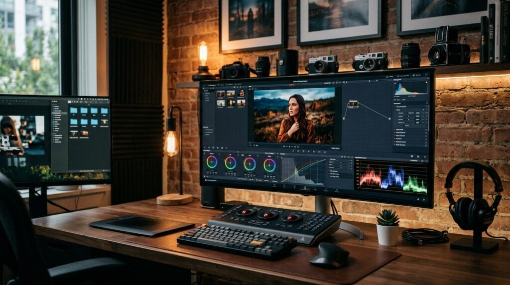
Essential Photoshop Color Grading Tools
Several Photoshop tools play important roles in professional workflows.
Learning these tools will improve your Photoshop color grading results significantly.
1. Curves Adjustment Layer
Curves is one of the most powerful color grading tools.
It helps control:
- Brightness
- Contrast
- Highlights
- Shadows
- Individual color channels
Many professional photographers rely heavily on Curves adjustments.
2. Color Balance Tool
Color Balance allows adjustments to:
- Shadows
- Midtones
- Highlights
This tool is commonly used for:
- Cinematic looks
- Warm color grading
- Cool color grading
- Creative visual styles
Color Balance is a key component of effective Photoshop color grading.
3. Selective Color Adjustment
Selective Color provides precise color control.
Useful for adjusting:
- Reds
- Blues
- Greens
- Yellows
- Neutrals
This tool helps refine specific color areas without affecting the entire image.
4. Gradient Maps
Gradient Maps create unique color transformations.
Benefits include:
- Cinematic color schemes
- Consistent visual styles
- Fast creative experimentation
Many modern creators use Gradient Maps during advanced color grading workflows.
Photoshop Color Grading Workflow for Beginners
Following a structured workflow helps produce consistent results.
1. Start With Color Correction
Before creative editing:
- Fix exposure
- Adjust white balance
- Improve contrast
- Remove color casts
Good color grading starts with a technically balanced image.
2. Build Overall Mood
Ask yourself. Should the image feel:
- warm?
- dramatic?
- nostalgic?
- luxurious?
Mood selection guides your Photoshop color grading decisions.
3. Adjust Contrast
Contrast improves depth and visual interest.
Use Curves to:
- Deepen shadows
- Brighten highlights
- Improve tonal balance
Balanced contrast creates stronger visual impact.
4. Refine Color Palette
Choose colors that support the story.
Examples:
- Orange and teal for cinematic visuals
- Warm gold tones for lifestyle photography
- Cool blue tones for winter scenes
- Earthy colors for travel photography
Consistent palettes improve visual storytelling.
Photoshop Color Grading for Cinematic Photography
Cinematic editing remains one of the most popular styles.
Characteristics include:
- Soft contrast
- Teal shadows
- Warm highlights
- Controlled saturation
- Moody atmosphere
Creating the Orange and Teal Look
The orange and teal style remains popular because it creates strong color contrast.
Process:
- Add teal tones to shadows
- Add warm orange tones to highlights
- Adjust saturation carefully
- Fine-tune skin tones
This Photoshop color grading style works especially well for portraits and travel photography.
Also Read: Photoshop Editing Tutorial Step by Step for Better Results
Photoshop Color Grading for Warm Lifestyle Photos
Warm editing creates emotional and inviting images.
Popular adjustments include:
- Increased yellow tones
- Soft orange highlights
- Reduced blue saturation
- Gentle contrast enhancements
Warm grading works well for:
- Family photography
- Weddings
- Lifestyle content
- Travel photography
Warm Color Grading Tips
Focus on:
- Natural skin tones
- Soft highlights
- Balanced warmth
- Realistic shadows
Overdoing warmth can make photos look unnatural.
Photoshop Color Grading for Moody Photography
Moody editing creates dramatic visual atmosphere.
Common characteristics include:
- Deep shadows
- Muted colors
- Reduced brightness
- Strong contrast
Many photographers use this style for storytelling and artistic projects.
Building Moody Color Palettes
Popular moody colors include:
- Dark greens
- Deep blues
- Muted browns
- Soft grays
These tones create emotional depth and sophistication.
Photoshop Color Grading for Portrait Photography
Portraits require careful color management.
Skin tones should remain natural even when applying creative effects.
Maintaining Natural Skin Tones
When performing Photoshop color grading, avoid:
- Excessive saturation
- Extreme orange shifts
- Unrealistic skin colors
Balanced skin tones improve professional quality.
Enhancing Portrait Mood
Subtle grading often works best.
Adjustments may include:
- Warm highlights
- Soft shadows
- Gentle contrast
- Reduced distractions
Portrait editing should enhance the subject rather than overpower it.
Photoshop Color Grading for Travel Photography
Travel photography often benefits from vibrant yet controlled color grading.
Goals include:
- Highlighting scenery
- Improving atmosphere
- Strengthening storytelling
Popular Travel Color Styles
Examples include:
- Tropical warm tones
- Desert-inspired palettes
- Coastal blue aesthetics
- Earth-tone travel looks
Consistent editing improves portfolio cohesion.
Also Read: Photoshop Remove Background and Replace With New Backdrops
Photoshop Color Grading Using LUTs
LUTs (Look-Up Tables) are popular among photographers and creators.
Benefits include:
- Faster editing
- Consistent style
- Workflow efficiency
However, LUTs should be adjusted rather than applied blindly.
Customizing LUT Results
Always review:
- Exposure
- Saturation
- Contrast
- Skin tones
Custom adjustments help create professional-looking results.
Common Mistakes in Photoshop Color Grading
Many beginners make similar editing mistakes.
1. Oversaturation
Too much saturation often looks unrealistic.
Subtle color grading usually feels more professional.
2. Crushed Shadows
Extremely dark shadows reduce detail.
Maintain balance between drama and visibility.
3. Unrealistic Skin Tones
Portrait photography requires careful skin tone control.
Natural-looking colors improve image quality.
4. Applying Every Trend
Not every popular style fits every image.
Choose grading techniques based on story and subject matter.
Best Tools for Photoshop Color Grading
Several tools support professional workflows.
1. Adobe Photoshop
Useful for:
- Curves adjustments
- Color Balance controls
- Selective Color editing
- Advanced masking
Photoshop remains one of the most powerful color grading platforms available.
2. Adobe Lightroom
Helpful for:
- Batch editing
- Color consistency
- Preset management
- Photography workflows
Many photographers combine Lightroom and Photoshop.
3. Capture One
Popular for:
- Professional color control
- Tethered shooting
- Advanced color editing
- Commercial photography workflows
Capture One is highly regarded for color precision.
Future Trends in Photoshop Color Grading
Photography editing continues evolving.
Popular trends include:
- Cinematic storytelling
- Film-inspired color palettes
- AI-assisted editing
- Natural skin tone preservation
- Soft luxury aesthetics
- Editorial-inspired grading styles
However, strong fundamentals remain more important than temporary trends.
Also Read: The Best Photoshop Keyboard Shortcuts For Designers, Editors, And Creatives
Final Thoughts on Photoshop Color Grading
Learning Photoshop color grading is one of the most valuable skills photographers and creators can develop. Color grading transforms technically correct images into emotionally engaging visuals that tell stronger stories and create memorable impressions.
The best workflows focus on mood, consistency, and subtle refinement rather than extreme effects. By mastering tools such as Curves, Color Balance, Selective Color, and Gradient Maps, photographers can create professional styles that strengthen both personal portfolios and client projects.
Whether you prefer cinematic edits, warm lifestyle photography, moody portraits, or vibrant travel imagery, improving your Photoshop color grading skills will help your photos look more polished, professional, and visually compelling.
For high-quality fonts to boost your income, check out Letter Crafted. Our professional fonts are perfect for branding, marketing, and content creation. So, don’t miss this opportunity.