
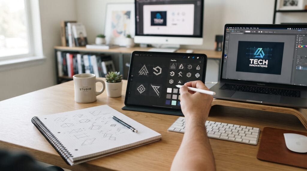
Technology logo design plays an important role in how SaaS companies and startups communicate innovation, trust, simplicity, and professionalism. A strong tech logo should look modern without becoming generic, work clearly at small sizes, and remain flexible enough for websites, apps, dashboards, social profiles, presentations, and future product launches.
Technology brands often compete in crowded markets where many businesses use similar visual language. Blue gradients, abstract shapes, rounded icons, and geometric sans serif typography appear everywhere.
The challenge is not simply creating something that looks technological.
The goal is building a visual identity that feels relevant to the industry while remaining distinctive enough to be remembered.
Below are practical technology logo design ideas for SaaS companies, software businesses, AI startups, digital platforms, and other modern technology brands.
1. Use a Simple Geometric Technology Logo Design
Geometric symbols are common in technology branding because they communicate structure, precision, and modernity.
You can build logos using:
- Circles
- Squares
- Triangles
- Hexagons
- Lines
- Modular grids
The strongest geometric logos usually use a simple construction rather than several complicated shapes.
A clean mark can be easier to recognize on an app icon, browser tab, or mobile interface.
2. Create an Abstract Technology Symbol
Abstract symbols give startups more freedom than literal icons.
Instead of using a computer, cloud, or circuit board directly, create a unique form inspired by the company’s concept.
An abstract symbol might communicate:
- Connection
- Speed
- Growth
- Automation
- Collaboration
- Intelligence
- Data flow
This approach is useful when a SaaS product may expand beyond its original feature set.
A broader symbol can support future growth better than an overly literal logo.
3. Build a Lettermark for Your Tech Startup
Lettermarks can be highly effective when a company has a long name or distinctive initials.
For example, the mark might use:
- One initial
- Two connected initials
- Overlapping letters
- Custom geometric lettering
- Negative-space letterforms
A lettermark can also function as an app icon.
For strong technology logo design, avoid simply typing an initial inside a circle.
Look for ways to customize the letter so it becomes recognizable as a proprietary brand asset.
4. Use a Modern Wordmark
Not every startup needs a separate symbol.
A custom wordmark can create a clean and professional identity while keeping the company name highly visible.
Wordmarks work particularly well for young brands that still need to build name recognition.
Consider adjusting:
- Letter spacing
- Individual characters
- Ligatures
- Terminal shapes
- Letter proportions
Small typographic modifications can turn a standard typeface into something more distinctive.
5. Explore Negative Space
Negative space can make a simple logo more memorable.
A hidden symbol might appear between letters or inside a geometric mark.
Possible ideas include:
- Arrow
- Connection point
- Data path
- Letter
- Network node
The secondary shape should be easy to understand rather than excessively clever.
If viewers need several seconds to discover the concept, the effect may be too complicated.
6. Use Connected Nodes for SaaS Branding
Connected dots and nodes can represent:
- Networks
- Collaboration
- Data
- Cloud systems
- Integration
- Communication
However, this visual style is common in technology branding.
To make it distinctive, experiment with an unusual structure, limited number of nodes, or custom geometry.
Avoid creating a generic collection of random points and connecting lines.
7. Create a Modular Logo System
Startups often need logos that appear in many different digital environments.
A modular identity can include:
- Full logo
- Horizontal logo
- Stacked version
- Symbol
- App icon
- Monochrome variation
This type of technology logo design is more practical than relying on one complicated logo for every situation.
The system should feel related even when different versions are used.
8. Design a Responsive Technology Logo
Responsive logos simplify as the available space becomes smaller.
For example:
- Desktop: Symbol + full company name
- Tablet: Symbol + shortened name
- Mobile: Symbol only
This approach is especially useful for digital-first businesses.
Your logo should remain recognizable in:
- Navigation bars
- Mobile apps
- Favicons
- Social avatars
- Software dashboards
Test the design at very small sizes before finalizing it.
9. Use Rounded Geometry
Rounded shapes often communicate friendliness and accessibility.
They can work well for:
- Productivity apps
- Collaboration software
- Consumer technology
- Education platforms
- Fintech products
Rounded corners can soften a technical identity and make the product feel easier to use.
However, too many rounded startup logos can look similar, so distinctive proportions and typography remain important.
10. Try Sharp Angular Forms
Sharp geometry creates a different impression.
Angular logos may communicate:
- Speed
- Performance
- Engineering
- Precision
- Security
This direction can work well for cybersecurity, developer tools, infrastructure products, or performance-focused platforms.
Match the visual language with the personality of the company rather than following a style only because it looks futuristic.
11. Use an Arrow Symbol
Arrows naturally communicate direction, progress, and movement.
They are useful for businesses related to:
- Analytics
- Growth
- Logistics
- Productivity
- Workflow
- Financial technology
Instead of using a standard arrow, integrate it into typography or negative space.
This can make the symbol feel more original.
Also Read: Dental Clinic Logo Design Ideas for Better Recognition and Trust
12. Create a Data-Inspired Logo
Data companies can build visual identities around simplified representations of information.
Ideas might include:
- Bars
- Grids
- Dots
- Waves
- Charts
- Data streams
Avoid making the mark resemble a literal dashboard.
Simplification is essential.
A good technology logo design should still work when viewers do not know the full conceptual explanation behind it.
13. Explore Pixel-Inspired Shapes
Pixels can connect visually to digital technology.
Instead of creating an old-fashioned computer graphic, use pixel forms in a more contemporary way.
Try:
- Breaking part of a letter into squares
- Building an abstract mark from modules
- Creating a subtle digital transition
This can be useful for software, gaming, AI, creative technology, and developer brands.
14. Use Motion-Inspired Forms
A static logo can still suggest movement.
Diagonal lines, repeated shapes, and directional forms can communicate:
- Speed
- Automation
- Transformation
- Progress
Motion-inspired logos work particularly well for startups focused on productivity, logistics, media, or real-time software.
15. Create a Cloud-Inspired Symbol Without Using a Literal Cloud
Cloud software companies frequently use cloud icons.
Unfortunately, this can make brands difficult to distinguish.
Instead, represent cloud technology through concepts such as:
- Distributed nodes
- Connected modules
- Floating layers
- Continuous loops
- Network structures
This creates a more original interpretation of the same idea.
16. Use AI-Inspired Technology Logo Design Carefully
AI startups often use visual references such as:
- Neural networks
- Spark shapes
- Brain imagery
- Data nodes
- Generative patterns
Because these symbols have become common, literal AI imagery can quickly feel generic.
A better approach is to build the identity around what the AI product actually does.
For example, an AI writing platform and an AI medical analytics company should not automatically use the same visual language.
17. Explore Loop and Infinity Symbols
Continuous loops can communicate:
- Automation
- Recurring workflows
- Integration
- Unlimited possibilities
- Continuous improvement
These ideas are relevant to SaaS products.
However, infinity-style logos are extremely common.
If you use this direction, modify the geometry or combine the loop with the company’s initials or other distinctive elements.
18. Create a Monoline Tech Logo
Monoline logos use strokes with relatively consistent thickness.
They can feel:
- Clean
- Modern
- Technical
- Lightweight
This style works well for SaaS brands that want a minimalist identity.
Make sure the line thickness remains visible at small sizes.
Extremely thin lines may disappear in favicons or app icons.
19. Use Custom Typography
Typography can provide more brand personality than another generic technology symbol.
Start with a suitable typeface and customize selected letters.
You might adjust:
- Crossbars
- Corners
- Curves
- Terminals
- Spacing
- Ligatures
Even one distinctive character can improve recognition.
For many startups, typography should be considered a central part of technology logo design, not an afterthought.
20. Combine a Symbol With a Wordmark
A symbol-and-wordmark combination is one of the most flexible approaches for startup branding.
The full logo introduces the company name.
Over time, the symbol can become recognizable enough to work independently.
This system is useful across:
- Websites
- Apps
- Social media
- Presentations
- Advertising
- Merchandise
Keep the visual relationship between symbol and typography consistent.
21. Use Gradients With Restraint
Gradients are strongly associated with modern digital branding.
They can add:
- Depth
- Energy
- Movement
- Digital character
However, complicated rainbow gradients can quickly dominate the identity.
Try using a controlled transition between two related colors.
Also create a flat-color version because your logo will not always appear in environments that support gradients effectively.
22. Build a Monochrome Technology Logo Design
A tech logo should not depend entirely on color.
Test it in:
- Black
- White
- Grayscale
If the symbol becomes unclear without its gradient or color palette, the underlying design may need improvement.
A strong monochrome version also makes branding easier across documents, merchandise, embossing, and small applications.
Also Read: Creative Bakery Logo Design Ideas That Look Professional
23. Use Blue Without Looking Generic
Blue remains popular in technology branding because it can communicate trust, stability, and professionalism.
You can still use it effectively.
The important thing is ensuring that typography, composition, and symbol design create differentiation.
Consider combining blue with:
- Purple
- Green
- Cyan
- Warm neutral tones
Color alone should not carry the entire brand identity.
24. Explore Unexpected Technology Colors
Not every startup needs blue.
Depending on the brand personality, consider:
- Orange
- Coral
- Lime
- Violet
- Warm yellow
- Deep red
Unexpected palettes can help a company stand apart from competitors.
Before choosing colors, study the visual landscape of the market.
25. Create a Dark-Mode Friendly Logo
Technology brands frequently appear inside dark interfaces.
Test your logo against both light and dark backgrounds.
Create appropriate versions rather than relying on automatic color inversion.
Pay attention to:
- Contrast
- Stroke visibility
- Color brightness
- Small text
This is especially important for developer tools, SaaS dashboards, AI platforms, and productivity software.
How to Create Better Technology Logo Design
Good logos begin with strategy rather than visual effects.
Before opening design software, define the company clearly.
Ask:
- What does the product do?
- Who is the target user?
- What makes the company different?
- What should the brand feel like?
- Who are the main competitors?
- Where will the logo appear most often?
These questions provide direction.
Without strategy, designers can easily create attractive logos that have little connection to the business.
Research Competitors Before Designing
Competitor research is particularly important for technology logo design because visual similarity is common in startup markets.
Create a simple competitor board.
Document:
- Logo shapes
- Colors
- Typography
- Symbols
- Common patterns
Then look for opportunities to differentiate.
If every competitor uses blue circles and lowercase sans serif typography, another blue circle may not be the strongest direction.
Technology Logo Design Typography Tips
Typography should reinforce the brand personality.
Geometric Sans Serif
Useful for brands that want to feel:
- Modern
- Structured
- Digital
Humanist Sans Serif
Can feel:
- Friendly
- Accessible
- Professional
Monospaced Typography
May work for:
- Developer tools
- Coding platforms
- Technical products
However, monospaced fonts can become overly literal if used without a clear reason.
Choose typography because it supports the brand strategy rather than because it looks technological.
Keep Technology Logo Design Simple
Complex logos can become difficult to use.
A startup logo may appear at 16 or 24 pixels inside a digital product.
Detailed circuits, multiple gradients, tiny lines, and complex patterns may disappear.
Try the reduction test.
Shrink the logo until it reaches typical favicon or interface-icon size.
If the core shape is still recognizable, the structure is likely working.
Technology Logo Design for SaaS Brands
SaaS logos need flexibility because they often appear directly inside the product.
A strong SaaS identity should work across:
- Login screens
- Dashboards
- Browser tabs
- Email notifications
- Documentation
- Help centers
- Mobile apps
This makes clarity and scalability particularly important.
A visually impressive logo that becomes unreadable inside a software interface is not practical.
Common Technology Logo Design Mistakes
Avoid these frequent problems.
Using Generic Tech Symbols
Clouds, circuits, brains, and random nodes can become predictable.
Look for a concept specific to the business.
Following Trends Too Closely
Gradients, rounded typography, and abstract blobs may be popular, but trends change.
Build enough timeless structure into the identity.
Making the Logo Too Complex
Small details often disappear in digital applications.
Simplify.
Ignoring Typography
A strong symbol paired with poor typography weakens the overall identity.
Treat both components as one system.
Designing Only for a White Background
Technology brands need versatile identity systems.
Test multiple environments.
Copying Competitor Colors
Industry conventions can be useful, but excessive similarity makes recognition more difficult.
Technology Logo Design Checklist
Before approving a final logo, ask:
- Is the logo easy to recognize?
- Does it connect with the product or brand?
- Is it different from competitors?
- Does it work at small sizes?
- Does the symbol work independently?
- Is the wordmark readable?
- Does it work in black and white?
- Does it work on dark backgrounds?
- Can it become an app icon?
- Does it fit a website navigation bar?
- Is the geometry consistent?
- Is the typography appropriate?
- Does the design rely too heavily on trends?
- Can the identity expand as the startup grows?
Testing these questions early can prevent expensive redesigns later.
Also Read: How to Create Salon Logo Design That Attracts More Clients
Final Thoughts on Technology Logo Design
Successful technology logo design combines clarity, relevance, scalability, and distinctiveness.
SaaS companies and startups have many visual directions available, from abstract geometry and lettermarks to custom typography, responsive icons, modular systems, and carefully controlled gradients.
The strongest choice depends on the company rather than the industry alone.
An AI platform, cybersecurity company, collaboration tool, fintech service, and creative SaaS product may all need dramatically different visual identities.
Start with the brand strategy.
Then explore several concepts rather than committing immediately to the first futuristic symbol.
Test each logo in realistic contexts such as websites, dashboards, mobile apps, presentations, and social profiles.
Most importantly, remember that good technology logo design does not need to look complicated to communicate innovation.
A simple mark with a strong concept, distinctive typography, and flexible visual system can often create a more memorable technology brand than a logo filled with unnecessary digital effects.
For high-quality fonts to boost your income, check out Letter Crafted. Our professional fonts are perfect for branding, marketing, and content creation. So, don’t miss this opportunity.