Learning strong graphic design layout ideas is one of the fastest ways to improve the quality of your creative work. Whether you design social media posts, websites, posters, branding projects, or presentations, layout plays a huge role in how people experience your visuals.
Many beginner creators focus heavily on colors or effects while ignoring structure and composition. However, even simple designs can look professional when the layout feels balanced and organized. This is why understanding modern graphic design layout ideas is essential for creators who want cleaner and more effective visuals.
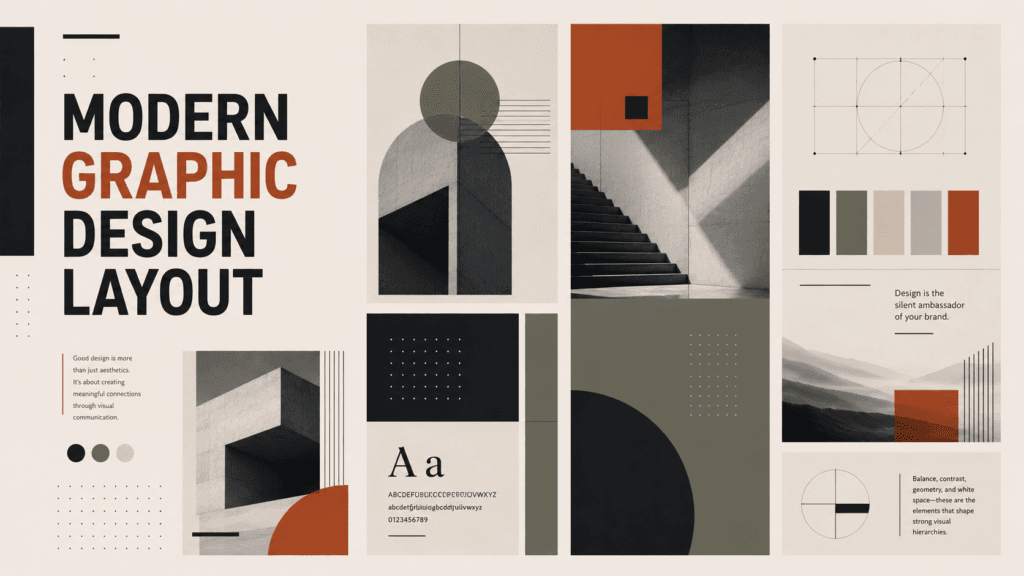
Good layout design helps guide the viewer’s attention naturally. It improves readability, strengthens visual hierarchy, and creates a smoother user experience. Modern design trends now focus heavily on minimalism, spacing, typography balance, and organized composition rather than overly complicated effects.
In this guide, you will learn practical graphic design layout ideas, visual balance techniques, typography structure, composition strategies, and modern layout inspiration that creators can use for digital and print design projects.
Why Graphic Design Layout Ideas Matter in Modern Design
Strong layouts improve communication.
Without structure, designs often feel:
- Cluttered
- Difficult to understand
- Visually overwhelming
- Unprofessional
Modern graphic design layout ideas help creators organize information clearly while maintaining visual appeal.
Good layouts help:
- Improve readability
- Create cleaner branding
- Guide viewer attention
- Increase engagement
- Improve user experience
- Support visual storytelling
For creators, layout design is just as important as color or typography.
Graphic Design Layout Ideas for Better Visual Hierarchy
Visual hierarchy controls how viewers scan information.
Good hierarchy tells people:
- What to look at first
- Which information matters most
- How to navigate the design
This is one of the most important graphic design layout ideas for beginners and professionals alike.
Typography-Based Graphic Design Layout Ideas
Typography strongly affects layout quality.
Modern layouts often use:
- Large bold headlines
- Minimal supporting text
- Strong spacing
- Simple alignment
Typography-driven layouts work well for:
- Posters
- Social media graphics
- Branding
- Editorial design
- Website headers
Bold Headline Layout Techniques
Large headlines create strong visual impact.
Popular layout styles include:
- Oversized typography
- Cropped text effects
- Centered headline layouts
- Asymmetrical headline placement
These techniques help modern designs feel more expressive and dynamic.
Minimal Typography Layout Ideas
Minimal typography layouts use:
- Clean spacing
- Few font styles
- Simple alignment
- Strong readability
Minimal layouts often feel:
- Elegant
- Modern
- Premium
- Professional
This style is extremely popular in modern branding.
Grid-Based Graphic Design Layout Ideas
Grid systems help organize visual elements consistently.
Using grids improves:
- Alignment
- Structure
- Spacing
- Balance
- Readability
Professional designers rely heavily on grids because they create cleaner compositions.
Column Grid Layout Ideas
Column grids are commonly used for:
- Websites
- Magazines
- Portfolio layouts
- Social media carousels
Columns help designers arrange information more efficiently.
Modular Grid Layout Ideas
Modular grids divide layouts into organized blocks.
This layout style works well for:
- Product showcases
- Ecommerce design
- Dashboard interfaces
- Creative portfolios
Grid systems are one of the most useful graphic design layout ideas for maintaining consistency.
Asymmetrical Graphic Design Layout Ideas
Asymmetrical layouts create dynamic visual balance.
Instead of centering everything evenly, designers intentionally place elements unevenly while maintaining harmony.
This style often feels:
- Creative
- Modern
- Editorial
- Trendy
Asymmetrical layouts are widely used in:
- Fashion branding
- Creative portfolios
- Music posters
- Social media campaigns
Layered Composition Layout Ideas
Modern layouts often overlap:
- Images
- Typography
- Shapes
- Text blocks
Layered composition adds depth and movement to designs.
This style is popular in:
- Streetwear branding
- Editorial posters
- Youth-focused marketing
Also Read: Graphic Design Typography Mistakes and How to Fix Them
White Space Graphic Design Layout Ideas
White space is one of the most powerful layout techniques.
Many beginners overcrowd their designs because they fear empty areas. However, professional layouts use white space strategically.
White space helps:
- Improve readability
- Create elegance
- Increase focus
- Reduce visual stress
Minimalist layouts often depend heavily on spacing for visual balance.
Luxury Layout Design Ideas
Luxury brands frequently use:
- Large spacing
- Minimal typography
- Clean compositions
- Simple color palettes
This creates a premium feeling without needing excessive decoration.
Graphic Design Layout Ideas for Social Media Content
Social media layouts need to communicate quickly.
Users scroll fast, so designs must attract attention immediately.
Effective social media layout techniques include:
- Strong visual hierarchy
- Bold headlines
- Simple text blocks
- Large focal points
- Consistent branding
Modern graphic design layout ideas for social media often combine typography with strong spacing and minimal clutter.
Instagram Layout Ideas for Creators
Popular Instagram layout styles include:
- Carousel grid layouts
- Minimal quote layouts
- Large typography posts
- Image-focused compositions
Consistency across posts helps creators build stronger branding.
TikTok and YouTube Thumbnail Layout Ideas
Video thumbnails require:
- Clear focal points
- Large readable text
- Strong contrast
- Emotional visuals
Simple layouts usually perform better than overcrowded designs.
Graphic Design Layout Ideas Using Color Contrast
Color affects visual structure significantly.
Good color contrast improves:
- Readability
- Focus
- Accessibility
- Emotional impact
Examples include:
- Dark backgrounds with white text
- Bright accent colors for call-to-action elements
- Neutral palettes with bold highlights
Color contrast is essential for balanced composition.
Editorial Graphic Design Layout Ideas
Editorial layouts combine typography and imagery carefully.
This style often feels:
- Sophisticated
- Organized
- Creative
- Professional
Editorial-inspired layouts are popular in:
- Fashion magazines
- Brand campaigns
- Portfolio websites
- Modern advertising
Magazine-Inspired Layout Ideas
Magazine layouts often use:
- Large typography
- Grid structures
- Image cropping
- Clean spacing
This creates a strong storytelling experience.
Graphic Design Layout Ideas for Branding Projects
Branding requires consistent layouts across multiple platforms.
Businesses need layouts for:
- Packaging
- Social media
- Websites
- Advertisements
- Presentations
Strong layouts help businesses appear more professional and trustworthy.
Brand Identity Layout Ideas
Consistent branding layouts usually include:
- Repeating typography systems
- Organized spacing
- Consistent alignment
- Unified color palettes
This improves brand recognition over time.
Also Read: Graphic Design Layout Ideas How to Use White Space Better
Best Tools for Graphic Design Layout Ideas
Modern design tools help creators build layouts more efficiently.
1. Canva
Helpful for:
- Social media layouts
- Presentation design
- Branding templates
- Beginner-friendly design workflows
Canva provides many layout templates for creators.
2. Adobe
Professional tools include:
Adobe products offer advanced layout control for professional designers.
3. Figma
Popular for:
- UI layouts
- Website wireframes
- App interfaces
- Collaborative workflows
Figma is widely used for modern digital layouts.
Common Mistakes in Graphic Design Layout Ideas
Many beginner creators make similar layout mistakes.
1. Overcrowded Layouts
Too many elements reduce clarity.
Simpler layouts usually communicate more effectively.
2. Weak Alignment
Poor alignment creates visual confusion.
Using grids and spacing systems improves structure instantly.
3. Too Many Fonts
Excessive font styles make layouts feel inconsistent.
Most professional layouts use only two or three typefaces.
4. Ignoring White Space
Crowded designs often feel stressful to view.
Spacing improves readability and balance.
How to Improve Graphic Design Layout Faster
The best way to improve layouts is through practice and observation.
Helpful strategies include:
- Studying modern posters
- Recreating layouts for learning
- Using grid systems
- Practicing typography balance
- Analyzing professional branding
- Simplifying compositions
Small improvements in spacing and alignment can dramatically improve design quality.
Future Trends in Graphic Design Layout Ideas
Modern design trends continue evolving.
Popular trends include:
- Minimalist layouts
- Bold typography systems
- AI-assisted layouts
- Interactive web compositions
- Editorial-inspired social media graphics
- Motion-based layouts
Creators who understand layout structure will adapt more easily to future trends.
Also Read: 25 AI Graphic Design Tools for Designers Want Better Results
Final Thoughts on Graphic Design Layout Ideas
Learning strong graphic design layout ideas helps creators build cleaner, more organized, and visually effective designs. Good layouts improve readability, communication, branding, and audience engagement across both digital and print platforms.
Modern design is moving toward simplicity, balance, spacing, and typography-focused composition rather than excessive decoration. By understanding grids, visual hierarchy, white space, asymmetrical balance, and typography structure, creators can dramatically improve their work.
Whether you design for social media, branding, websites, or content creation, mastering graphic design layout ideas will help your projects look more professional, modern, and visually balanced.
For high-quality fonts to boost your income, check out Letter Crafted. Our professional fonts are perfect for branding, marketing, and content creation. So, don’t miss this opportunity.