
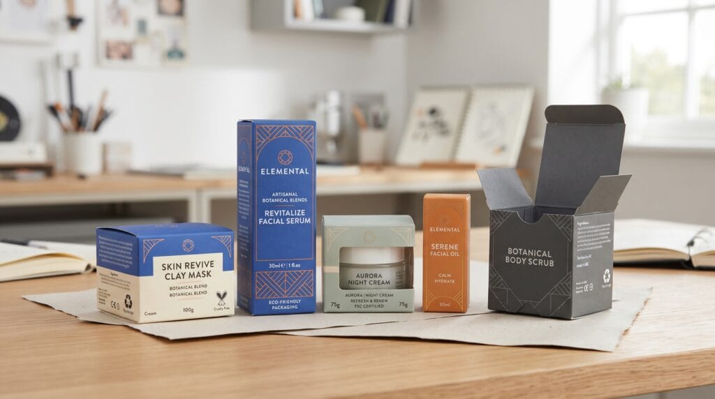
Carton packaging design plays an important role in how customers see, understand, and remember a product. Before someone opens a package, the carton already communicates information about quality, category, personality, and positioning. A carefully designed carton can make a product feel premium, natural, modern, practical, playful, or sophisticated before the customer even touches what is inside.
Cartons can be used across many product categories, including:
- Food
- Beauty
- Supplements
- Fashion accessories
- Electronics
- Household products
- Gifts
- Personal care
- Small consumer products
A successful carton does more than decorate a box.
It combines branding, product information, visual hierarchy, structure, materials, and practical protection into one complete presentation.
The strongest carton packaging design creates a clear connection between the product, the brand, and the customer experience.
Why Carton Packaging Design Matters
Packaging is often one of the first physical interactions customers have with a brand.
A carton may appear:
- On retail shelves
- In ecommerce photographs
- Inside shipping boxes
- In product displays
- In customer unboxing videos
Strong carton packaging design can help:
- Improve brand recognition
- Communicate product information
- Differentiate products
- Strengthen shelf visibility
- Support premium positioning
- Improve ecommerce presentation
- Create a better unboxing experience
- Build consistency across a product range
The package should attract attention while still making the product easy to understand.
Beautiful artwork cannot replace clear communication.
The best carton packaging balances both.
Start Carton Packaging Design With Brand Positioning
Before choosing colors, fonts, or illustrations, define how the brand should feel.
A product brand might be:
- Premium
- Minimal
- Natural
- Technical
- Playful
- Traditional
- Sustainable
- Bold
- Elegant
- Youthful
The packaging should support this direction.
For example, a premium product may use restrained colors, sophisticated typography, textured paper, and subtle finishing details.
A natural brand may use softer colors, simple printing, recycled cardboard, and botanical illustrations.
A younger lifestyle product may use bright colors, bold graphics, and more energetic typography.
The strongest carton packaging design connects every visual choice with a clear market position.
1. Minimalist Carton Packaging Design
Minimalist packaging uses fewer elements and gives important information more visual space.
A minimalist carton may include:
- Clear brand name
- Product name
- Simple typography
- Limited colors
- Small graphic elements
- Generous negative space
Minimalism does not mean making the package empty.
It means removing unnecessary visual noise.
A clean structure can make products feel more confident and professional.
Best for
Minimalist cartons can work well for:
- Premium products
- Beauty brands
- Technology products
- Wellness products
- Modern lifestyle brands
Keep the hierarchy clear so the customer can understand the product quickly.
2. Bold Color Carton Packaging
Color can create immediate shelf impact.
A product collection might use one consistent layout while changing the main color for each variation.
For example:
- Blue for one product type
- Green for another
- Orange for another
- Burgundy for a premium variation
This creates differentiation while maintaining brand recognition.
Use Color With Product Information
Do not rely on color alone.
Each carton should still clearly communicate:
- Product name
- Variation
- Size
- Important descriptors
Color-supported carton packaging design works best when the visual system remains understandable even without the color coding.
3. Illustrated Carton Packaging Design
Illustration can give packaging more personality.
Designers may use:
- Botanical artwork
- Hand-drawn graphics
- Flat vectors
- Line drawings
- Abstract illustrations
- Product-related imagery
A complete product collection should maintain a consistent illustration style.
Choose one direction instead of mixing unrelated techniques.
Illustration can be especially useful when the brand wants to communicate craftsmanship, creativity, ingredients, origin, or storytelling.
4. Luxury Carton Packaging Design
Luxury packaging depends on more than adding metallic effects.
Premium cartons may use:
- Structured boxes
- Embossing
- Foil stamping
- Textured paper
- Soft-touch finishes
- Restrained color palettes
- Refined typography
Common luxury colors may include:
- Black
- Cream
- Deep green
- Navy
- Burgundy
- Muted metallic accents
The design should feel controlled rather than overloaded.
Avoid False Luxury
Too many borders, metallic effects, scripts, or decorative elements can make a package feel less sophisticated.
Premium carton packaging design usually relies on restraint, materials, construction, and careful details.
Also Read: Luxury Packaging Design for Better Marketing Results
5. Sustainable Carton Packaging Design
Sustainability can influence both material choice and visual communication.
Possible approaches may include:
- Recycled cardboard
- Recyclable paper
- Minimal outer packaging
- Limited printing
- Reduced decorative layers
The design can support this direction through:
- Natural textures
- Simple typography
- Controlled inks
- Honest material information
Communicate Sustainability Clearly
Avoid using vague environmental claims simply because the package looks natural.
Instead, provide specific information when appropriate, such as:
- Made from recycled paper
- Recyclable after use
- Reduced packaging material
- Plastic-free outer carton
Sustainable carton packaging design should connect material choices with clear communication.
6. Geometric Carton Packaging
Geometric graphics can create a modern visual identity.
Designers may use:
- Repeating shapes
- Abstract patterns
- Modular grids
- Color blocks
- Simple symbols
This direction can work well for modern consumer brands that want to stand apart from traditional packaging.
However, avoid allowing decorative geometry to overpower product information.
The package still needs a clear hierarchy.
7. Carton Packaging Design With Storytelling
Packaging can also tell a brand story.
Illustrations or supporting information might communicate:
- Product origin
- Craftsmanship
- Manufacturing process
- Ingredients
- Brand history
- Sustainability
- Product inspiration
Storytelling adds emotional value.
However, the front panel should remain simple enough for customers to understand the product quickly.
Supporting stories can continue on:
- Side panels
- Back panels
- Interior surfaces
This keeps the front visually focused.
8. Carton Packaging Design for Product Collections
Many brands sell several related products.
The challenge is creating enough difference between products while keeping them clearly connected.
A consistent system might maintain:
- Logo position
- Typography
- Grid
- Illustration style
- Information hierarchy
Then vary:
- Color
- Product name
- Illustration
- Secondary pattern
This makes a product family easier to recognize.
Consistent carton packaging design also improves the visual impact when several products appear together on shelves or ecommerce pages.
9. Carton Packaging Design With Transparent Windows
Some cartons use transparent windows so customers can see the product.
Window shapes may include:
- Circles
- Arches
- Geometric forms
- Custom brand shapes
A window can create trust by revealing the actual product.
However, it should feel integrated with the overall design.
Avoid adding a window simply as decoration.
Consider whether visibility actually improves the customer experience and whether the product should be exposed to light.
Typography in Carton Packaging Design
Typography plays a major role in product communication.
A carton may require type for:
- Brand name
- Product name
- Product variation
- Ingredients
- Instructions
- Quantity
- Product description
- Regulatory information
Serif Typography
Serifs can communicate:
- Tradition
- Elegance
- Premium quality
- Editorial character
Sans Serif Typography
Sans serif fonts can create:
- Clarity
- Simplicity
- Modernity
- Professionalism
Script Typography
Scripts may add personality or craftsmanship.
Use them carefully and avoid decorative scripts for small information.
Display Typography
Distinctive display fonts can give product names more personality.
However, readability should remain a priority.
Most carton packaging design works better with one expressive typeface and one highly readable supporting typeface.
Also Read: Sustainable Packaging Design for Better Marketing Results
Color in Carton Packaging Design
Color can communicate product personality and help customers identify variations.
Possible directions include:
- Green: Natural, fresh, wellness
- Blue: Trust, calmness, technology
- Orange: Energy, warmth, creativity
- Red: Strength, boldness, attention
- Purple: Creativity, premium positioning
- Black: Sophistication and luxury
- Cream: Natural warmth and simplicity
These associations are useful starting points rather than strict rules.
A brand can use unexpected colors if the system remains consistent and easy to understand.
Information Hierarchy on Carton Packaging
Customers should not need to search for basic information.
A practical front panel might include:
- Brand name
- Product name
- Product variation
- Key descriptor
- Quantity or weight
Supporting information can move to the sides or back.
This may include:
- Instructions
- Ingredients
- Brand story
- Product details
- Required information
Strong hierarchy helps carton packaging design feel cleaner and more professional.
Packaging Materials and Structure
Visual design should support the physical carton rather than ignore it.
The package needs to protect the product while maintaining a professional appearance.
Possible carton-related structures can include:
- Folding cartons
- Rigid boxes
- Paperboard sleeves
- Gift boxes
- Carton-based product sets
Material choice should consider:
- Product type
- Price
- Shipping
- Shelf display
- Brand positioning
The attached reference also emphasizes that packaging structure must protect the product and that attractive branding cannot compensate for unsuitable packaging.
A beautiful carton that becomes damaged easily can weaken the entire customer experience.
Dielines and Carton Packaging Design
A packaging design must eventually fit a physical structure.
Designers need to consider the dieline when planning:
- Front panels
- Back panels
- Side panels
- Fold areas
- Important information
Do not place critical text too close to folds or structural edges.
Always review the package both Flat and Assembled.
A flat artwork file may appear balanced while the final three-dimensional carton feels different.
Helpful Carton Packaging Design Tools
Several tools can support different parts of the workflow.
Adobe Illustrator
Useful for:
- Logos
- Dielines
- Vector graphics
- Patterns
- Print-ready packaging artwork
Adobe Photoshop
Useful for:
- Image editing
- Textures
- Packaging mockups
- Product presentation
Adobe InDesign
Helpful for packaging projects with larger amounts of text or multiple product variations.
Pacdora
Useful for packaging templates, dielines, and 3D mockups.
Esko ArtiosCAD
Designed for more advanced structural packaging and custom carton development.
Blender
Useful for creating custom 3D packaging visualizations.
These same categories of tools are also used in the attached packaging reference for dielines, structural development, image editing, layouts, and mockups.
Common Carton Packaging Design Mistakes
Overloading the Front Panel
Move secondary information elsewhere.
Using Too Many Fonts
A controlled typography system feels more professional.
Making Product Variations Look Unrelated
Create a consistent visual family.
Ignoring the Carton Structure
Artwork must work with folds and physical construction.
Depending Too Much on Effects
Foil, embossing, and special finishes cannot replace good composition.
Ignoring Shelf Visibility
Test the carton from realistic viewing distances.
Ignoring Ecommerce Presentation
The design should remain recognizable as a small product image.
Using Unsuitable Materials
Structure and materials must support the actual product.
Carton Packaging Design Checklist
Before approving the packaging, confirm:
- Brand positioning is clear
- Product name is easy to identify
- Typography remains readable
- Color system feels consistent
- Product variations work together
- Information hierarchy is clear
- Carton structure protects the product
- Materials match the brand direction
- Dieline placement has been checked
- Fold areas are considered
- Mockups reflect the actual structure
- The design works on shelves
- The design works online
- Print finishes have been tested
- Final artwork is organized
- Required product information is included
- Fonts and visual assets are properly licensed
A final checklist can catch small issues before they become expensive production problems.
Also Read: 15 Common Packaging Design Mistakes and How to Fix Them
Final Thoughts
Strong carton packaging design combines branding with practical product presentation.
- Minimalist systems can communicate confidence.
- Illustrations can create personality.
- Color coding can improve product differentiation.
- Luxury materials and finishes can support premium positioning.
- Sustainable materials can reinforce responsible branding.
However, these elements work best when the foundation is clear.
- Begin with brand positioning.
- Choose an appropriate carton structure.
- Build a consistent visual system.
- Create strong typography and information hierarchy.
- Then refine color, illustration, materials, and finishing details.
- Avoid decoration that does not serve a purpose.
Every element should help customers:
- Recognize the brand
- Understand the product
- Distinguish variations
- Enjoy the presentation
The most effective carton packaging design makes branding and structure feel like one complete system rather than two separate decisions.
When the visual identity, physical carton, materials, typography, and information work together, product brands can create packaging that looks more professional, communicates more clearly, and builds stronger recognition across retail shelves and ecommerce environments.
For high-quality fonts to boost your income, check out Letter Crafted. Our professional fonts are perfect for branding, marketing, and content creation. So, don’t miss this opportunity.