
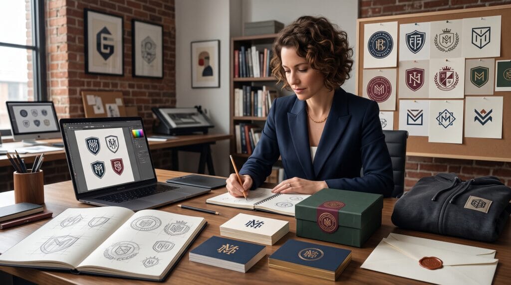
A strong emblem logo design combines typography, symbols, and structured shapes into one recognizable brand mark. Unlike a simple wordmark or standalone icon, an emblem usually places its visual elements inside a badge, shield, circle, crest, or decorative frame. This creates a compact identity that can communicate tradition, authority, craftsmanship, community, or premium quality.
Emblems are often associated with schools, sports teams, restaurants, automotive brands, coffee shops, outdoor companies, and heritage businesses. However, modern designers can also use them for fashion labels, creative studios, digital products, personal brands, and contemporary startups.
The challenge is balancing detail with clarity. An emblem may look impressive at a large size but become unreadable when printed on a small label or displayed as a social media profile image. Every element needs a clear purpose.
This guide explains how to create an emblem logo design that feels distinctive, balanced, scalable, and suitable for real branding applications.
What Is an Emblem Logo Design?
An emblem logo design integrates the business name, initials, date, slogan, or other typography with a surrounding shape or symbol. The text and graphics usually function as one connected composition rather than separate logo elements.
Common emblem structures include:
- Circular badges
- Shields
- Crests
- Seals
- Rectangular frames
- Diamond shapes
- Arched labels
- Decorative borders
- Monogram badges
- Institutional marks
Emblems can communicate a strong sense of identity because they resemble official seals, patches, stamps, and traditional signage.
However, not every business needs an emblem. This style is most effective when the structured appearance supports the brand personality.
Why Emblem Logo Design Works for Branding
A well-planned emblem logo design can make a business appear established and memorable. Its compact structure is useful across packaging, uniforms, signage, stickers, merchandise, and social media.
Emblems can help brands:
- Communicate heritage and credibility
- Create a strong visual center
- Combine text and imagery
- Build recognition
- Support merchandise
- Create decorative brand patterns
- Work as packaging seals
- Add personality to signage
- Communicate community or membership
- Create a collectible visual identity
The enclosed structure can also make an emblem feel complete. Customers see the mark as one recognizable unit rather than a collection of disconnected elements.
Start Emblem Logo Design With Brand Strategy
Before choosing a shield or circular border, define what the brand needs to communicate.
Ask:
- Who is the target audience?
- What does the business offer?
- Should the brand feel traditional or modern?
- Does it need to communicate authority, warmth, adventure, or craftsmanship?
- Where will the emblem appear?
- How small will it need to become?
- Will it be embroidered, engraved, stamped, or printed?
- Does the company name fit comfortably inside an emblem?
A premium coffee brand might use a refined circular seal with elegant typography. An outdoor company may prefer a rugged shield with mountains or trees. A contemporary fashion label could use a minimal monogram inside a simple geometric frame.
Brand strategy prevents the emblem logo design from becoming decorative without meaning.
Research Competitor Emblem Logos
Competitor research helps designers understand familiar industry patterns and avoid creating an identity that looks too similar to existing brands.
Study:
- Badge shapes
- Common symbols
- Typeface styles
- Color palettes
- Text placement
- Dates and slogans
- Border systems
- Illustration complexity
- Logo applications
For example, many coffee shops use circular badges with beans, cups, or mountains. To create a more original direction, a designer might focus on the origin of the coffee, the architecture of the location, or a distinctive letter from the brand name.
Research should reveal opportunities for differentiation rather than provide designs to copy.
Choose the Right Emblem Logo Structure
The overall shape strongly influences how an emblem feels.
Circular Emblem Logo Design
Circular emblems feel balanced, complete, and versatile. They work well for:
- Cafes
- Restaurants
- Breweries
- Sports teams
- Handmade products
- Community groups
- Packaging seals
Text can follow the curve of the circle, while a symbol or monogram occupies the center.
Circular designs need careful spacing. Curved text can become difficult to read if the radius is too small or the letters are too tightly spaced.
Shield Emblem Logo Design
Shields communicate protection, strength, authority, and tradition.
They are suitable for:
- Security companies
- Automotive brands
- Schools
- Sports organizations
- Outdoor products
- Heritage businesses
Modern shields can use simple geometry and minimal details. They do not always need ornate medieval decoration.
Crest Logo Design
Crests often include several symbolic elements, such as animals, crowns, leaves, initials, banners, or regional references.
They work well for premium, institutional, family, or heritage brands.
Because crests can become complicated, designers should simplify each component and create a reduced version for small applications.
Rectangular and Arched Emblems
Rectangular badges and arched frames can feel practical, industrial, or vintage.
They are useful for:
- Workwear
- Food packaging
- Automotive services
- Barbershops
- Vintage clothing
- Local businesses
These formats often provide more horizontal space for longer business names.
Build a Clear Visual Hierarchy
An emblem may contain several pieces of information, but they should not receive equal attention.
A typical hierarchy might be:
- Business name
- Main symbol or monogram
- Product category
- Establishment date
- Location or slogan
The business name should usually remain the most visible text unless the central symbol is already well known.
Use size, weight, placement, contrast, and spacing to guide attention.
Avoid making the founding date, location, and slogan as large as the brand name. Supporting information should remain secondary.
Strong hierarchy is one of the most important principles in professional emblem logo design.
Also Read: Clean Logo Fonts That Look Simple but Professional
Select Typography for Emblem Logo Design
Typography gives the emblem much of its personality. It must fit inside the structure while remaining readable.
Serif Typography
Serif fonts can communicate heritage, authority, craftsmanship, or sophistication.
They suit:
- Premium food brands
- Hotels
- Schools
- Heritage products
- Traditional services
Choose serifs with enough weight to remain clear when printed or embroidered.
Sans Serif Typography
Sans serif fonts can make an emblem feel modern, direct, and versatile.
They work well for:
- Contemporary cafes
- Outdoor brands
- Technology businesses
- Sports teams
- Minimal fashion labels
Condensed sans serif fonts are useful when the business name is long and must fit inside a narrow space.
Script Typography
Script fonts can add craftsmanship, personality, or nostalgia. They often work best for one important word rather than every piece of text.
Avoid placing a highly decorative script along a tight curve. Complex letterforms may become unreadable.
Custom Lettering
Custom lettering can make an emblem logo design more distinctive.
Designers may adjust:
- Letter spacing
- Stroke endings
- Ligatures
- Baseline curves
- Character width
- Crossbars
- Terminals
- Selected initials
Small modifications can create originality without sacrificing readability.
Choose Meaningful Symbols
The central symbol should connect to the brand rather than simply fill empty space.
Possible emblem symbols include:
- Initials
- Animals
- Tools
- Plants
- Buildings
- Landscapes
- Product silhouettes
- Geometric shapes
- Cultural references
- Abstract forms
A bakery could use wheat, but a more distinctive symbol might reference its founder, location, signature product, or traditional baking method.
An outdoor company does not always need mountains. It could use a trail marker, compass detail, local tree, or simplified landscape connected to its origin.
The most memorable emblem logo design uses symbols that support a real story.
Create a Strong Monogram Centerpiece
Monograms work especially well inside emblems because they create a compact focal point.
Explore arrangements such as:
- Interlocking initials
- Mirrored letters
- Shared strokes
- Stacked characters
- Initials inside a shield
- Negative-space combinations
- Symmetrical letterforms
The monogram should remain understandable when separated from the full emblem. This allows it to function as a social icon, merchandise mark, favicon, or small packaging symbol.
Avoid combining too many initials. Two letters are usually easier to balance than three or four.
Use Borders and Decorative Elements Carefully
Borders help define the structure, but too many layers can make an emblem feel crowded.
Common decorative elements include:
- Double circles
- Dotted borders
- Stars
- Leaves
- Banners
- Dividing lines
- Small diamonds
- Ropes
- Geometric ornaments
Choose a small number of details that reinforce the concept.
For example, a refined restaurant emblem might use one thin border and two small stars. A rugged outdoor badge could use a heavier frame and simple directional lines.
Every decorative element should remain visible at the smallest intended size.
Balance Symmetry and Personality
Many emblem logos use symmetry because it creates stability and authority. However, perfect symmetry can sometimes feel too formal or predictable.
Designers can introduce personality through:
- An asymmetrical symbol
- Custom lettering
- An unexpected border break
- One offset detail
- Varied text placement
- Controlled negative space
The composition should still feel balanced even when it is not perfectly mirrored.
Sketch several variations before moving into detailed vector work. Early exploration makes it easier to compare circular, shield, crest, and monogram arrangements.
Choose Colors for Emblem Logo Design
Emblems often work best with a limited color palette.
Reliable options include:
Black and White
A black-and-white emblem feels timeless and reproduces easily through printing, stamping, engraving, and embroidery.
Navy and Gold
This combination communicates trust, tradition, and premium quality.
Forest Green and Cream
Green and cream can suit outdoor brands, sustainable products, cafes, and natural businesses.
Burgundy and Beige
Burgundy creates warmth and heritage, while beige softens the overall identity.
Red, White, and Blue
This high-contrast combination can work for sports, local brands, and bold institutional identities.
The final emblem logo design should always work in one color. Color should enhance the concept, not rescue a weak structure.
Also Read: Typography Logo Trends You Should Follow for Better Results
Make the Emblem Scalable
Scalability is one of the biggest challenges in emblem design.
Test the logo at:
- Large signage size
- Business card size
- Packaging-label size
- Social avatar size
- Favicon size
- Embroidery size
Small text, thin borders, and detailed illustrations may disappear when reduced.
Create a responsive logo system that includes:
- Full detailed emblem
- Simplified emblem
- Central monogram
- Standalone symbol
- Wordmark variation
- One-color version
The detailed version can appear on large packaging or signage, while the simplified mark handles smaller uses.
Test Emblem Logo Design in Real Applications
Mockups help determine whether the emblem works beyond the design software.
Test it on:
- Storefront signs
- Product packaging
- Coffee cups
- Uniform patches
- Caps
- T-shirts
- Business cards
- Stickers
- Bottles
- Shopping bags
- Social media profiles
Do not rely only on realistic mockups. Also show the emblem clearly on plain light and dark backgrounds.
A professional presentation should demonstrate both visual appeal and practical performance.
Helpful Emblem Logo Design Tools
1. Adobe Illustrator
Useful for precise vector construction, curved text, monograms, borders, and production-ready logo files.
2. Affinity Designer
A strong professional alternative for creating scalable emblem artwork.
3. Inkscape
A free vector design application suitable for logo construction, paths, typography, and export.
4. Figma
Helpful for concept development, collaborative feedback, and digital logo applications.
5. Procreate
Useful for sketching, custom lettering, ornaments, and illustrated emblem ideas.
Begin with sketches before refining the final design in vector software.
Common Emblem Logo Design Mistakes
1. Adding Too Many Details
Complexity can destroy readability at small sizes.
2. Using Too Much Text
Long slogans, dates, locations, and descriptions can make the emblem crowded.
3. Choosing Thin Typography
Delicate type may disappear during printing, engraving, or embroidery.
4. Copying Vintage Badge Templates
Templates can create a starting point, but the final design should reflect the specific brand.
5. Ignoring Negative Space
Crowded emblems need more breathing room between text, symbols, and borders.
6. Creating Only One Version
A detailed emblem needs simplified variations for digital and small-scale applications.
7. Using Unlicensed Fonts
Verify that every typeface permits commercial logo usage.
Emblem Logo Design Checklist
Before approving the logo, confirm that it:
- Reflects the brand strategy
- Uses a suitable emblem shape
- Has clear visual hierarchy
- Includes readable typography
- Uses meaningful symbols
- Remains balanced
- Works in one color
- Performs well at small sizes
- Includes simplified variations
- Can be printed and embroidered
- Looks distinct from competitors
- Uses licensed fonts and graphics
- Works on both light and dark backgrounds
- Includes organized vector files
Also Read: 3D Logo Design Trends and Examples That Stand Out
Final Thoughts on Emblem Logo Design
A successful emblem logo design combines a clear brand concept with balanced typography, meaningful symbolism, strong structure, and practical scalability. Circular badges, shields, crests, monograms, and framed wordmarks can all create memorable identities when every element supports the same message.
Begin with strategy and sketch several structures before selecting a final direction. Keep the hierarchy clear, limit unnecessary details, and test the logo in black and white. Then create responsive variations for small labels, social media, packaging, signage, and merchandise.
The best emblem is not the one with the most ornaments. It is the one that remains recognizable, communicates the brand’s personality, and performs reliably wherever it appears.
By approaching emblem logo design as a flexible identity system rather than one decorative badge, designers can create professional logos that stand out and remain useful for years.
For high-quality fonts to boost your income, check out Letter Crafted. Our professional fonts are perfect for branding, marketing, and content creation. So, don’t miss this opportunity.