
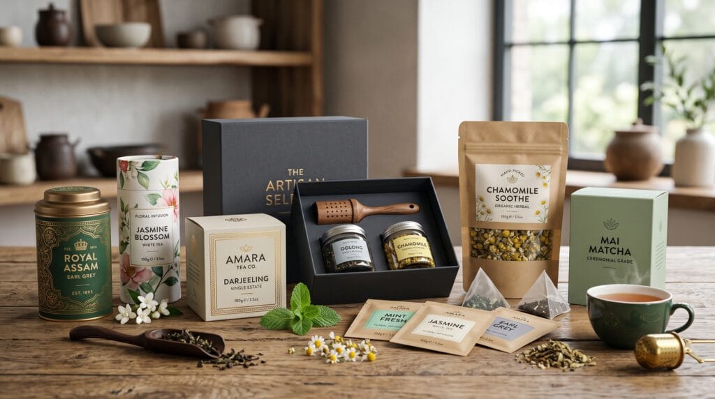
Tea packaging design examples can help beverage brands understand how color, typography, structure, illustration, and materials work together to shape customer perception. Before shoppers taste the product, packaging creates expectations about quality, flavor, origin, price, and brand personality. A well-designed tea package can make a simple product feel premium, natural, modern, traditional, or gift-worthy.
Tea is sold in many formats, including loose leaves, tea bags, sachets, tins, cartons, tubes, pouches, and gift boxes. Each format creates different design opportunities and technical requirements. The package must protect aroma and freshness while making the product easy to identify and appealing on shelves or ecommerce pages.
The best tea packaging design examples do more than decorate a box. They communicate the tea variety clearly, build a recognizable visual system, support product collections, and create a memorable customer experience.
This guide explores practical tea packaging directions that can inspire better branding for specialty tea companies, herbal brands, cafes, wellness businesses, and growing beverage companies.
Why Tea Packaging Design Examples Matter
Packaging is one of the most important customer touchpoints for a tea brand. It may be the first branded object a customer holds, opens, stores, and sees repeatedly in the kitchen.
Strong tea packaging design examples demonstrate how packaging can:
- Build brand recognition
- Communicate flavor and aroma
- Differentiate tea varieties
- Support premium pricing
- Explain origin and ingredients
- Improve shelf visibility
- Create gift appeal
- Strengthen ecommerce presentation
- Encourage repeat purchases
- Support sustainable positioning
Tea packaging also needs to balance emotion with information. Customers may be attracted by beautiful artwork, but they still need to understand whether the product is green tea, black tea, herbal tea, loose leaf, caffeinated, or caffeine-free.
A successful design makes the product desirable without sacrificing clarity.
Start Tea Packaging Design With Brand Positioning
Before choosing colors or illustrations, define how the brand should be perceived.
A tea business may position itself as:
- Premium and refined
- Natural and organic
- Traditional and heritage-focused
- Modern and minimalist
- Playful and youthful
- Wellness-oriented
- Artisan and handmade
- Sustainable and ethical
- Gift-focused
- Experimental and creative
The packaging direction should reflect the target customer and price level.
A luxury tea brand might use structured boxes, serif typography, restrained colors, and foil accents. A wellness tea company may prefer soft colors, natural materials, and clear ingredient information. A younger lifestyle brand could use bold color coding and playful illustrations.
The strongest tea packaging design examples connect every visual decision to a clear market position.
1. Minimalist Tea Packaging Design
Minimalist packaging uses limited colors, generous spacing, clear typography, and controlled details.
This direction works well for modern tea brands that want to communicate quality, simplicity, and confidence.
A minimalist tea package may include:
- One strong brand name
- A clear tea variety
- A restrained color palette
- Small botanical details
- Simple icons
- Plenty of negative space
- Clean ingredient information
Minimalism does not mean removing useful content. It means organizing information so customers can understand the product quickly.
Best for
- Premium loose-leaf tea
- Contemporary cafes
- Wellness brands
- Subscription products
- Online tea shops
- Modern gift sets
Among the most effective tea packaging design examples, minimalist systems often use one consistent layout and change only the color or small illustration for each flavor.
2. Botanical Tea Packaging Design
Botanical illustrations are a natural fit for tea because they connect the packaging with ingredients, origin, and flavor.
Designers can illustrate:
- Tea leaves
- Flowers
- Herbs
- Citrus
- Spices
- Berries
- Roots
- Regional plants
A chamomile package may feature delicate yellow flowers, while a mint tea could use fresh green leaves. A spiced blend might include cinnamon, cardamom, or cloves.
Keep Illustrations Consistent
A complete tea collection should use the same illustration style across all varieties.
Choose one approach:
- Watercolor
- Vintage botanical engraving
- Flat vector
- Minimal line art
- Hand-drawn ink
- Cut-paper illustration
Mixing unrelated styles can make the product family feel inconsistent.
Botanical tea packaging design examples work especially well for herbal, organic, and natural brands.
3. Color-Coded Tea Packaging Collections
Color coding helps customers distinguish products quickly.
A brand may assign colors such as:
- Green for green tea
- Red for berry blends
- Yellow for chamomile
- Blue for calming tea
- Orange for citrus
- Purple for floral blends
- Brown for black tea
- Pink for rose or hibiscus
The system should remain recognizable even when several packages are displayed together.
Use Color With Supporting Labels
Do not rely on color alone. Include the tea name, variety, and clear descriptive text.
Color-coded tea packaging design examples are effective because they create shelf impact while making the collection easy to navigate.
4. Luxury Tea Packaging Design
Luxury tea packaging focuses on materials, proportion, typography, and finishing details.
Common premium elements include:
- Rigid boxes
- Metal tins
- Embossing
- Foil stamping
- Soft-touch finishes
- Textured paper
- Magnetic closures
- Fabric ribbons
- Interior compartments
The design should feel refined rather than overloaded.
A premium package may use deep green, navy, burgundy, black, cream, or muted metallic accents. Serif typography and carefully spaced capitals can reinforce the luxury direction.
Avoid False Luxury
Gold effects, decorative borders, and complex scripts do not automatically create a premium identity. Quality comes from restraint, materials, construction, and consistency.
Luxury tea packaging design examples often use fewer elements but execute each one carefully.
5. Sustainable Tea Packaging Design
Sustainable packaging is increasingly important for environmentally conscious tea brands.
Possible materials include:
- Recyclable paper
- Compostable pouches
- Refillable tins
- Minimal outer packaging
- Plant-based films
- Recycled cardboard
- Reusable glass jars
The visual identity can support sustainability through natural textures, limited inks, simple printing, and honest environmental information.
Communicate Sustainability Clearly
Avoid vague claims such as “eco-friendly” without explanation.
Instead, include specific information such as:
- Made from recycled paper
- Refillable container
- Plastic-free packaging
- Compostable inner pouch
- Recyclable after use
Sustainable tea packaging design examples should combine responsible materials with clear communication rather than relying only on green colors and leaf symbols.
6. Traditional Tea Packaging Design
Traditional packaging can communicate heritage, craftsmanship, and cultural origin.
Possible visual elements include:
- Historic patterns
- Regional symbols
- Traditional typography
- Decorative borders
- Classic tea illustrations
- Cultural color palettes
- Origin stories
- Established dates
This approach can work well for brands with genuine historical or regional connections.
Use Cultural References Respectfully
Research symbols, patterns, languages, and traditions carefully. Avoid using cultural elements only as decoration without understanding their meaning.
Traditional tea packaging design examples are strongest when they tell a real story about origin, family history, farming methods, or preparation traditions.
Also Read: Top Cosmetic Packaging Design Trends for Better Branding
7. Modern Geometric Tea Packaging
Geometric packaging creates a bold and contemporary identity.
Designers may use:
- Abstract shapes
- Repeated patterns
- Blocks of color
- Structured grids
- Simple symbols
- Modular layouts
This direction can help a tea brand stand out from competitors that rely heavily on botanical or vintage visuals.
Geometric tea packaging design examples are suitable for:
- Urban tea brands
- Younger audiences
- Creative cafes
- Experimental blends
- Modern gift products
Keep the visual system controlled. Too many patterns and colors may make important information difficult to read.
8. Illustrated Storytelling Packaging
Some tea brands use packaging to tell a story.
Illustrations may depict:
- Tea farms
- Landscapes
- Harvesting
- Local wildlife
- Farmers
- Brewing rituals
- Seasonal scenes
- Imaginary characters
Storytelling can create emotional value and make packaging more memorable.
For example, each tea variety could represent a different region, season, or time of day. The complete collection then becomes a visual journey.
These tea packaging design examples work well for artisan brands, gift collections, and products with strong origin stories.
9. Tea Tin Packaging Design
Metal tins provide durability, freshness protection, and reusable value.
Tins can be:
- Cylindrical
- Rectangular
- Square
- Stackable
- Hinged
- Embossed
Tea tins often feel more premium than disposable cartons or pouches. They also remain visible in the customer’s home after purchase, extending brand exposure.
Design for Reuse
A reusable tin should look attractive enough to keep.
Consider:
- A timeless color palette
- Durable printing
- Clear lid design
- Simple refill labels
- Stackable shapes
- Collectible series
Tin-based tea packaging design examples are especially effective for loose-leaf tea, gifts, and subscription products.
10. Tea Pouch Packaging Design
Flexible pouches are practical, lightweight, and suitable for many tea products.
They can support:
- Resealable closures
- Window panels
- Matte finishes
- Paper-like textures
- Full-color printing
- Small production quantities
Pouches work well for loose-leaf tea, refills, herbal blends, and ecommerce shipping.
Create a Strong Front Panel
The front should clearly show:
- Brand name
- Tea variety
- Flavor or ingredients
- Product type
- Net weight
The back can include brewing instructions, origin, story, ingredients, and regulatory information.
Pouch tea packaging design examples often use bold color blocks or central labels to improve recognition.
11. Gift Box Tea Packaging
Tea is frequently purchased as a gift, making presentation an important part of the product.
Gift packaging may include:
- Multiple flavors
- Divided compartments
- Sample sachets
- Brewing accessories
- Personalized cards
- Seasonal sleeves
- Decorative closures
The unboxing experience should feel organized and intentional.
Use a consistent hierarchy so customers can identify every tea variety inside the box.
Gift-focused tea packaging design examples can support holidays, corporate gifting, weddings, hospitality, and premium subscriptions.
12. Seasonal Tea Packaging Design
Seasonal editions create variety without requiring a complete rebrand.
Themes may include:
- Spring florals
- Summer citrus
- Autumn spices
- Winter warmth
- Christmas gifts
- Lunar New Year
- Ramadan and Eid
- Mother’s Day
- Valentine’s Day
A seasonal package should still feel connected to the core identity.
Keep the logo, typography, layout, or main color system consistent while changing illustrations, accents, sleeves, or secondary colors.
Seasonal tea packaging design examples are useful for limited editions, gift sets, and promotional campaigns.
13. Wellness Tea Packaging Design
Wellness teas often focus on benefits such as sleep, digestion, focus, calm, or energy.
Packaging must communicate these uses carefully and clearly.
A wellness tea system may include:
- Benefit-focused product names
- Soft colors
- Calm typography
- Clear ingredients
- Brewing instructions
- Time-of-day icons
- Caffeine information
Avoid exaggerated medical claims. Packaging should follow applicable labeling and advertising requirements.
Wellness tea packaging design examples work best when they appear trustworthy, informative, and easy to understand.
14. Playful Tea Packaging for Younger Audiences
Tea brands targeting younger customers may use:
- Bold colors
- Friendly characters
- Casual typography
- Stickers
- Illustrated ingredients
- Humorous product names
- Social-media-friendly graphics
This approach can make tea feel more approachable and less traditional.
However, playful design still needs structure. Product names, flavors, and instructions should remain clear.
The best playful tea packaging design examples balance personality with professional consistency.
Also Read: Food Packaging Design for Brands That Want Better Results
15. Transparent Window Tea Packaging
A transparent window allows customers to see the tea leaves, flowers, or ingredients.
This can communicate freshness and product quality.
Window shapes may include:
- Circles
- Leaves
- Arches
- Geometric forms
- Custom brand symbols
Avoid making the window too large if light exposure could affect the product.
A transparent feature should support the identity rather than appear as an unrelated cutout.
Typography in Tea Packaging Design Examples
Typography helps customers understand the product and shapes the brand personality.
A tea package may need type styles for:
- Brand name
- Tea variety
- Flavor name
- Ingredients
- Brewing instructions
- Origin
- Net weight
- Regulatory information
Serif Typography
Serifs can feel refined, traditional, editorial, or premium.
Sans Serif Typography
Sans serif fonts create a cleaner, more contemporary appearance.
Script Typography
Scripts may add craftsmanship or personality but should be limited to short names or accents.
Display Typography
Distinctive display fonts can help product names stand out, but readability remains essential.
Most tea packaging design examples benefit from one display typeface and one highly readable supporting font.
Color Psychology for Tea Packaging
Color can communicate flavor and mood.
Common associations include:
- Green for freshness and natural tea
- Red for berries and strong flavor
- Yellow for citrus and energy
- Purple for floral or calming blends
- Brown for traditional black tea
- Blue for calmness and evening tea
- Pink for rose and delicate blends
- Orange for spice and warmth
These associations are helpful but not strict rules.
A brand can create a distinctive identity by using unexpected colors, provided the product remains easy to identify.
Information Hierarchy on Tea Packaging
Customers should quickly understand what they are buying.
A practical front-panel hierarchy may include:
- Brand name
- Tea variety
- Flavor or blend name
- Product type
- Key descriptor
- Net weight
Supporting information can appear on the side or back.
Avoid giving every element equal size. Strong hierarchy makes tea packaging design examples feel more professional and easier to shop.
Brewing Instructions and Product Clarity
Brewing instructions add practical value and improve the customer experience.
Include:
- Water temperature
- Brewing time
- Amount of tea
- Number of servings
- Hot or cold preparation
- Re-steeping guidance
Use icons when they improve clarity, but include text where necessary.
Instructions should be easy to find and large enough to read.
Packaging Materials and Structure
The package should protect tea from:
- Moisture
- Light
- Air
- Odors
- Physical damage
Common structures include:
- Foil-lined pouches
- Folding cartons
- Metal tins
- Glass jars
- Paper tubes
- Individual sachets
- Rigid gift boxes
The best structure depends on the tea format, price, shipping method, and expected shelf life.
Beautiful branding cannot compensate for packaging that fails to protect the product.
Helpful Tea Packaging Design Tools
Designers can use several tools throughout the process.
1. Adobe Illustrator
Useful for logos, labels, patterns, dielines, and print-ready artwork.
2. Adobe Photoshop
Suitable for image editing, mockups, textures, and ecommerce visuals.
3. Adobe InDesign
Helpful for packaging systems with extensive text and multiple product variations.
4. Pacdora
Useful for packaging templates, dielines, and 3D mockups.
5. Esko ArtiosCAD
Designed for advanced structural packaging and custom carton development.
6. Blender
Suitable for custom 3D product visualization and realistic packaging scenes.
7. Canva
Helpful for early mood boards, simple concepts, social content, and small-brand presentations.
Common Tea Packaging Design Mistakes
1. Using Generic Leaf Graphics
Tea leaves are relevant but may not create a distinctive identity.
2. Making Every Variety Look Unrelated
Product collections need a consistent visual system.
3. Using Decorative Fonts for Small Text
Ingredients and instructions must remain readable.
4. Overloading the Front Panel
Move supporting information to side or back panels.
5. Ignoring Shelf and Thumbnail Visibility
The package should remain recognizable in stores and ecommerce listings.
6. Using Unsuitable Materials
Packaging must protect freshness as well as communicate the brand.
7. Making Vague Sustainability Claims
Use specific, accurate environmental information.
8. Forgetting Regulatory Requirements
Labels may need ingredients, weight, origin, allergen, nutrition, or business information depending on the market.
Tea Packaging Design Checklist
Before approving the package, confirm that:
- The brand positioning is clear.
- The tea variety is easy to identify.
- The design works as a collection.
- Typography remains readable.
- Colors support product differentiation.
- Brewing instructions are included.
- Ingredients are clearly listed.
- The structure protects freshness.
- Materials suit the brand promise.
- The package works in stores and online.
- Sustainable claims are accurate.
- Required legal information is included.
- Print finishes have been tested.
- Mockups reflect the final structure.
- All fonts and visual assets are properly licensed.
Also Read: Luxury Packaging Design for Better Marketing Results
Final Thoughts on Tea Packaging Design Examples
The best tea packaging design examples combine strong branding with practical product communication. Minimalist systems can create modern confidence, botanical illustrations can highlight ingredients, and premium tins can strengthen gift appeal. Sustainable materials, clear color coding, and readable instructions can further improve the customer experience.
Begin with a clear brand position and choose a packaging structure that protects the tea properly. Then build a visual system using consistent typography, colors, illustrations, and information hierarchy.
Avoid adding decoration without purpose. Every element should help customers understand the product, recognize the brand, or enjoy the experience of opening and using the package.
By studying and applying strong tea packaging design examples, tea brands can improve shelf appeal, communicate quality, create more memorable collections, and build stronger long-term customer recognition.
For high-quality fonts to boost your income, check out Letter Crafted. Our professional fonts are perfect for branding, marketing, and content creation. So, don’t miss this opportunity.