Effective UX dashboard design is one of the most important factors in creating successful SaaS products and digital platforms. A dashboard often serves as the central hub where users monitor data, manage tasks, track performance, and make important decisions. When a dashboard is easy to navigate and understand, users become more productive and engaged. When it feels confusing, users become frustrated and may abandon the product.
Modern SaaS platforms generate large amounts of information. Without thoughtful organization, dashboards can quickly become cluttered and overwhelming. This is why strong UX dashboard design focuses on clarity, usability, information hierarchy, and efficient navigation.
A well-designed dashboard helps users find important information quickly while minimizing cognitive load. It should guide attention toward key metrics and actions rather than forcing users to search through complex interfaces. The goal is not simply to display data but to help users understand and act on that data.
In this guide, you will learn practical UX dashboard design principles, navigation strategies, data visualization techniques, usability best practices, and SaaS design patterns that improve user experience.
Why UX Dashboard Design Matters for SaaS Products
Dashboards are often the most frequently used part of a SaaS platform.
Good UX dashboard design helps users:
- Find information faster
- Make better decisions
- Complete tasks efficiently
- Understand performance metrics
- Reduce frustration
- Increase product adoption
A dashboard should support user goals rather than create unnecessary complexity.
UX Dashboard Design and Information Hierarchy
Information hierarchy determines how users scan and understand content.
Strong UX dashboard design prioritizes information based on importance.
Users should immediately recognize:
- Key performance indicators (KPIs)
- Critical alerts
- Primary actions
- Important trends
- Recent activity
Without hierarchy, dashboards often feel overwhelming.
Prioritizing Dashboard Content
Start by identifying:
- Most important metrics
- Frequently used actions
- Business-critical data
- User goals
Place these elements in highly visible areas.
Less important information should appear lower on the page.
UX Dashboard Design for Better Navigation
Navigation is one of the most important aspects of dashboard usability.
Users should always know:
- Where they are
- What they can do
- How to move between sections
Effective UX dashboard design makes navigation feel effortless.
Sidebar Navigation in Dashboard Interfaces
Sidebar navigation remains one of the most popular dashboard patterns.
Benefits include:
- Clear structure
- Easy scalability
- Consistent access to features
- Better organization
Many SaaS products use side navigation because it supports growing feature sets.
Top Navigation in SaaS Dashboards
Top navigation works well when:
- Feature sets are limited
- Content categories are simple
- Mobile responsiveness is important
The choice depends on product complexity and user needs.
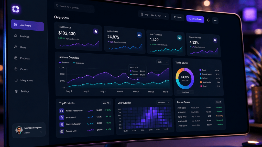
UX Dashboard Design and Data Visualization
Data visualization helps users interpret information quickly.
Numbers alone can be difficult to process.
Strong UX dashboard design uses visual elements such as:
- Charts
- Graphs
- Progress indicators
- Comparison metrics
- Trend visualizations
Visual representation improves understanding significantly.
Choosing the Right Dashboard Charts
Different charts serve different purposes.
Examples include:
- Line charts for trends
- Bar charts for comparisons
- Pie charts for proportions
- Tables for detailed information
Choosing the correct visualization improves clarity.
UX Dashboard Design for User Productivity
Productivity-focused dashboards reduce unnecessary effort.
Every element should support user goals.
Good UX dashboard design helps users:
- Complete tasks faster
- Access important tools quickly
- Monitor progress efficiently
- Reduce repetitive actions
The interface should work with users rather than against them.
Designing Action-Oriented Dashboards
Action-oriented dashboards highlight:
- Next steps
- Tasks requiring attention
- Pending actions
- Performance goals
This approach encourages engagement and productivity.
Also Read: Dashboard UI Design You Should Follow for Better Results
UX Dashboard Design for SaaS User Experience
SaaS dashboards often support daily workflows.
Users may interact with the dashboard multiple times per day.
Strong UX dashboard design focuses on:
- Speed
- Simplicity
- Consistency
- Accessibility
Frequent users benefit from predictable interfaces.
Reducing Cognitive Load
Cognitive load refers to the mental effort required to use an interface.
Reduce cognitive load by:
- Limiting unnecessary elements
- Using clear labels
- Grouping related content
- Maintaining consistency
Simple interfaces are often more effective than feature-heavy designs.
UX Dashboard Design and Dashboard Layouts
Layout structure directly affects usability.
Good layouts create logical flow and organization.
Common dashboard areas include:
- Header section
- Navigation area
- Main content region
- Data visualization blocks
- Quick action panels
Well-organized layouts improve scanning behavior.
Grid Systems in Dashboard Design
Grid systems help maintain consistency.
Benefits include:
- Better alignment
- Visual balance
- Predictable structure
- Easier scalability
Most modern dashboards rely heavily on grid-based layouts.
UX Dashboard Design for Mobile Usability
Many users access SaaS products on mobile devices.
Responsive UX dashboard design ensures functionality across screen sizes.
Mobile dashboards should prioritize:
- Essential data
- Touch-friendly controls
- Simplified navigation
- Readable content
Mobile usability is increasingly important.
Responsive Dashboard Design Techniques
Helpful strategies include:
- Collapsible navigation menus
- Adaptive layouts
- Responsive charts
- Prioritized content blocks
Mobile-first thinking improves accessibility.
UX Dashboard Design and User Personalization
Personalization improves dashboard relevance.
Not every user needs the same information.
Modern UX dashboard design often allows users to:
- Rearrange widgets
- Customize views
- Save preferences
- Filter content
Customization helps users focus on what matters most.
Role-Based Dashboard Experiences
Different users have different goals.
Examples:
- Executives need strategic metrics
- Managers need team performance data
- Operators need task-focused information
Personalized dashboards improve usability significantly.
UX Dashboard Design Best Practices for Accessibility
Accessibility improves usability for all users.
Strong UX dashboard design should support:
- Keyboard navigation
- Screen readers
- Color contrast standards
- Readable typography
Accessible design expands usability and inclusivity.
Improving Dashboard Readability
Readability depends on:
- Font size
- Contrast
- Spacing
- Visual hierarchy
Users should never struggle to interpret important information.
Also Read: UX Writing Guide for Better User Engagement and Clarity
UX Dashboard Design Metrics to Measure Success
Design decisions should be validated with data.
Useful metrics include:
- Task completion rate
- User retention
- Time on task
- Navigation success rate
- User satisfaction scores
Measuring results helps improve dashboard experiences continuously.
User Testing for Dashboard Usability
User testing helps identify:
- Navigation problems
- Confusing layouts
- Missing information
- Interaction challenges
Real user feedback often reveals unexpected issues.
Best Tools for UX Dashboard Design
Several tools help designers build effective dashboards.
1. Figma
Useful for:
- Dashboard wireframes
- UI design systems
- Interactive prototypes
- Team collaboration
Figma remains one of the most popular dashboard design tools.
2. Adobe XD
Helpful for:
- Interface design
- Prototyping
- User flow creation
- Design presentations
Adobe XD supports dashboard design workflows.
3. Miro
Useful for:
- User journey mapping
- Information architecture
- Collaborative planning
- UX workshops
Miro helps teams organize design thinking activities.
4. Hotjar
Helpful for:
- Heatmaps
- Session recordings
- User behavior analysis
- UX research
Hotjar helps identify usability issues after launch.
Common Mistakes in UX Dashboard Design
Many dashboards suffer from avoidable problems.
1. Too Much Information
Overloaded dashboards create confusion.
Prioritize essential content.
2. Poor Navigation Structure
Users should never struggle to find key features.
Clear navigation improves adoption.
3. Misleading Data Visualizations
Charts should communicate information accurately.
Complex visualizations often reduce understanding.
4. Ignoring User Goals
Dashboards should support user objectives rather than simply display data.
Design around user needs first.
Future Trends in UX Dashboard Design
Dashboard interfaces continue evolving.
Popular trends include:
- AI-powered insights
- Personalized dashboards
- Predictive analytics
- Real-time data visualization
- Minimal UI systems
- Adaptive interfaces
Future dashboards will focus increasingly on decision support rather than raw data presentation.
How Product Designers Can Improve UX Dashboard Design
Designers can improve dashboards by:
- Conducting user research
- Simplifying navigation
- Prioritizing key information
- Testing layouts regularly
- Measuring usability metrics
- Iterating based on feedback
Continuous improvement leads to better user experiences.
Also Read: Dark Mode UX Trends You Should Follow for Better Results
Final Thoughts on UX Dashboard Design
Effective UX dashboard design helps users navigate information efficiently, complete tasks faster, and make better decisions. In SaaS products, dashboards often serve as the primary workspace, making usability and navigation critical to success.
The best dashboards combine clear information hierarchy, intuitive navigation, meaningful data visualization, responsive layouts, and user-centered design principles. Rather than overwhelming users with information, successful dashboards focus on clarity, relevance, and actionability.
By applying proven UX dashboard design strategies, product designers can create interfaces that improve adoption, increase productivity, and deliver better overall user experiences for modern SaaS platforms.
For high-quality fonts to boost your income, check out Letter Crafted. Our professional fonts are perfect for branding, marketing, and content creation. So, don’t miss this opportunity.